When it comes to designing and producing packaging, color is often a crucial factor to consider. Oftentimes, you may find that the final product isn’t exactly what you had imagined to begin with. This discrepancy can often be mitigated by understanding where these differences come from and taking the appropriate precautions to get as close to the color you’re looking for.
Factors That Affect Color Appearance
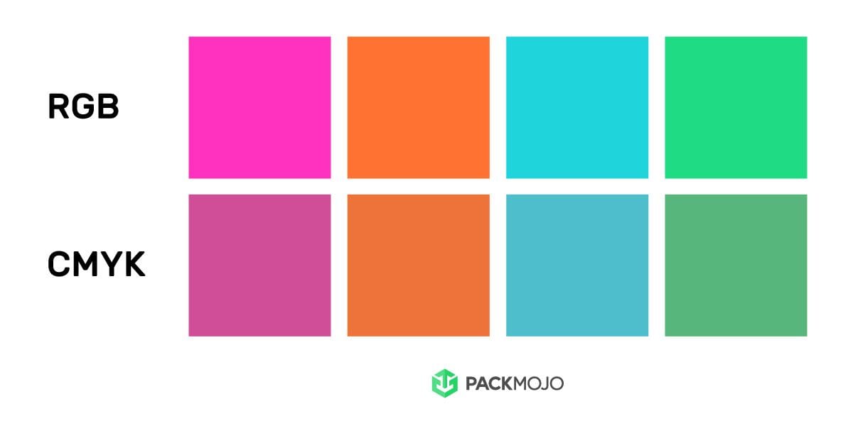
Often time colors that you see on a screen will appear differently as those that are printed. RGB is the on-screen color system that produces visible color using red, green and blue and is backlit on a screen. CMYK, on the other hand, is the printed color system that generates the appearance of different colors by combining different combinations of cyan, magenta, yellow and black inks. Therefore, for packaging, it is crucial to ensure that you are using the CMYK color system for your designs.
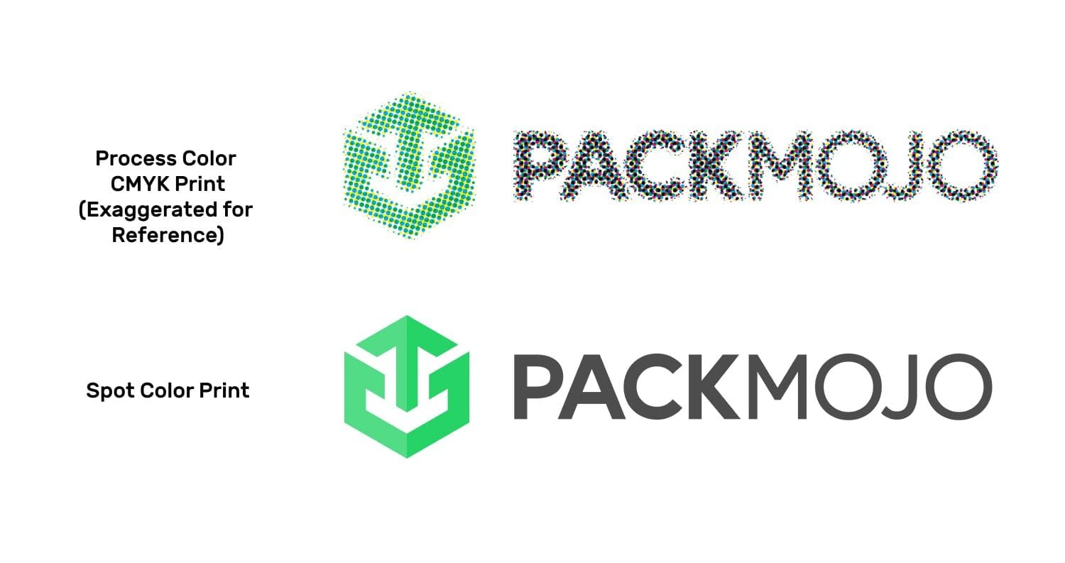
If you require specific colors for your designs, you may also consider using a spot color system such as Pantone. Spot colors utilize pre-mixed color inks as opposed to the layering of several colors that CMYK process colors use. Therefore, it allows you to get a more consistent and accurate color. To learn more about spot colors vs process colors, click here.
Lighting from digital screens and software differences can also affect color appearances as well as different in-person lighting environments. Different levels of screen contrasts and brightnesses as well as variations of screens such as LCD screens can result in slightly different appearances to individuals.
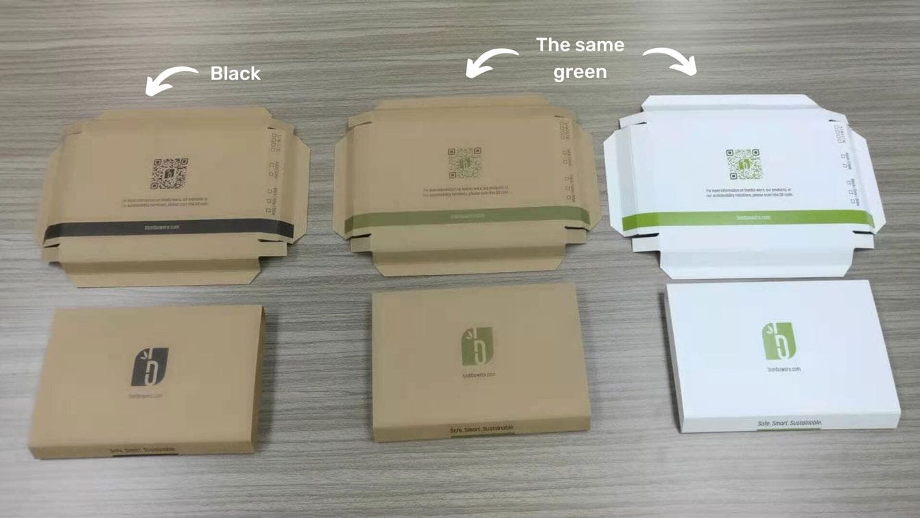
Different base paper materials will also affect how colors appear. Different types of substrates absorb colors to different degrees such that colors will appear brighter and more vibrant on some materials, such as proofing paper, compared to others. Other choice differences that can affect the absorbency of inks include white or brown kraft and coated or uncoated materials.
To learn more about why colors can appear different on screen vs when printed, read here.
How You Can Ensure You’re Getting The Colors You Want
The first step you should take to achieve the colors you want is to make sure that your design files are in CMYK mode. To learn how to do this, feel free to reference this blog post. Though this still may not give you the absolute exact color that you will see once your packaging is printed, this will digitally be as close as possible to the final result. If you have a specific color you must achieve, the best way to do this is by selecting a corresponding Pantone color.
If you prefer not to use Pantone colors, the next best way is to provide your design file with the desired colors. Providing CMYK color codes or CMYK color codes of Pantone colors does not allow for accurate coloring because different computer programs and applications may interpret the color codes slightly differently. Between different software, CMYK colors are often slightly converted such that different systems will provide slightly different color codes.
From a CMYK color code, we are only able to get a general idea of what color you are seeking. Since HEX codes and RGB color codes are used for digital color on screen and therefore highly reliant on backlighting to generate the right color. Providing us with these values will not allow us to accurately provide you with the color you desire and therefore please refrain from providing RGB or HEX codes as a color reference. The best way to ensure you’re getting a color most similar to what you desire is to provide design files with the appropriate colors.
For any flooded colors (which refers to colors spanning a larger area such as the background colors of a box), we recommend using spot colors such as Pantone. Process colors are more susceptible to color differences, therefore spot colors will help to mitigate obvious color discrepancies within and across production runs. To learn more about why this happens, read about process colors vs spot colors.
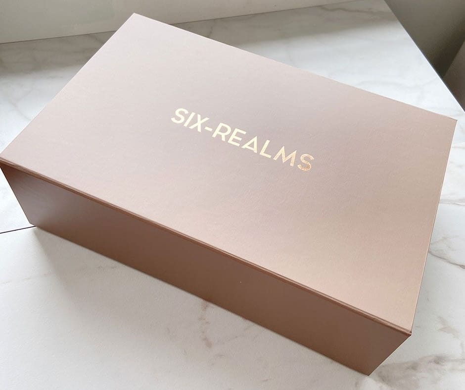
Ultimately, the most foolproof way to ensure you are achieving the exact color you desire is to get a sample of your packaging. For accurate coloring, the most budget-friendly option is to get a print proof. Once you’re happy with the print proof, we will use this print proof to color match during production. Though they are a little more expensive, other samples that will also offer accurate color would be the press proof and pre-production samples. Do note that simplified samples do not provide accurate colors as they are printed using sampling machines.
Closing Thoughts
Having an understanding of the factors that can result in different printed colors to on-screen colors can allow you to manage expectations for color differences during production. To ensure that you are able to achieve your desired colors, double-check that you’re designing in CMYK color mode. When it comes to providing colors, the best practice is to avoid providing color codes and instead provide source files with desired colors. For precise colors or large areas of one color, consider using spot colors such as Pantone. Finally, consider getting samples to verify coloring before production. Explore our variety of custom samples here.
