While designing printing material or packaging dielines, we often come across the words RGB, CMYK, and PMS along with an array of other topics and terms. It can get overwhelming without knowing what’s what and what goes where. With this blog post, we aim to bring you up to speed on the different color spaces or systems, when to use them, and how they can help you while designing your packaging.
For a brief summary take a look at this help article or the infographic below. In short, you want to use RGB for digital materials, CMYK for print materials and Pantone if you're looking for specific and exact colors.
Before jump into defining RGB, CMYK, and PMS, we first need to understand the differences between process colors and spot colors.
Process color vs. Spot color
Process colors are made by mixing inks during the printing process. Four primary inks are mixed to form your desired shade. These primary inks form the CMYK color system (more on that below). Process printing is also called four-color printing and is often interchangeably used with CMYK.
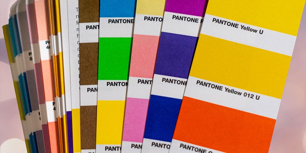
Spot colors, on the other hand, are premixed colors. These shades require their own printing plates and press which makes them more expensive to use than process colors. However, spot colors allow the production of a wider range of shades, including fluorescent and metallic, as compared to process colors. Spot colors are great to use when the accuracy of the shade is the number one priority. Pantone is the most common spot color system.
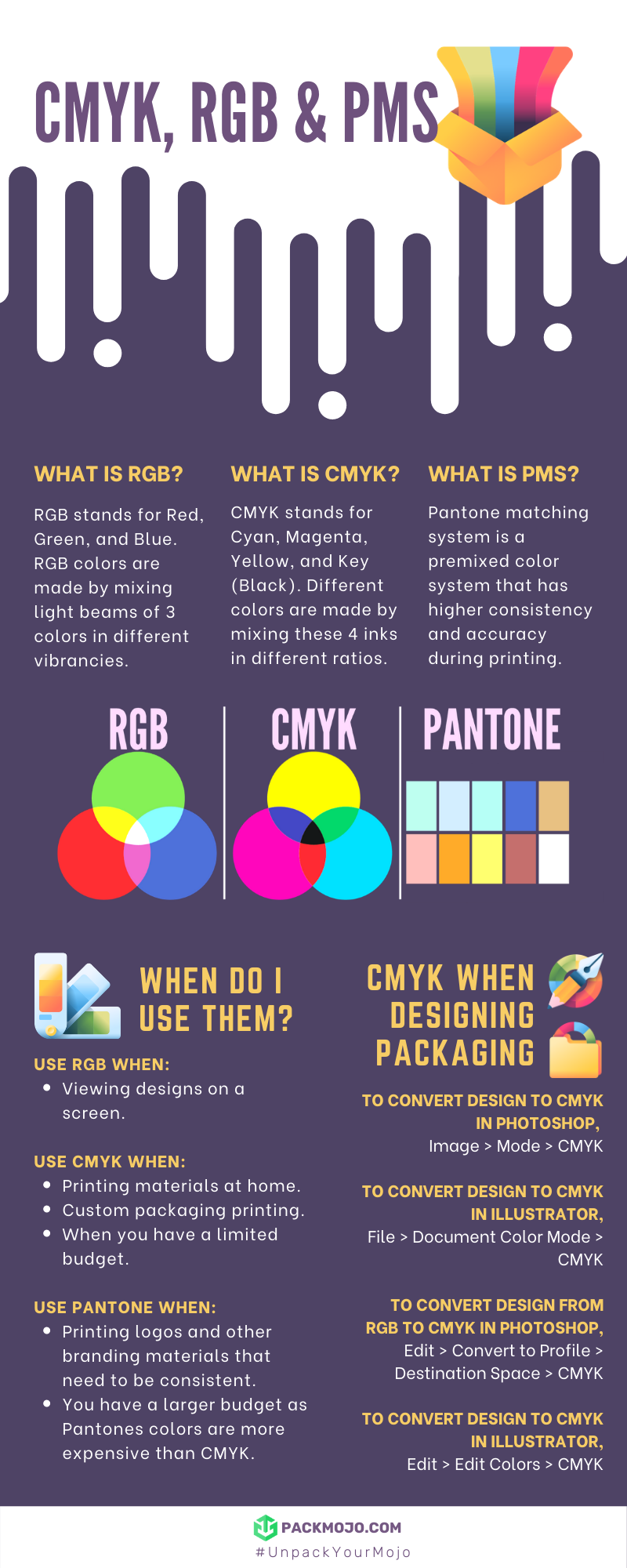
What is RGB?
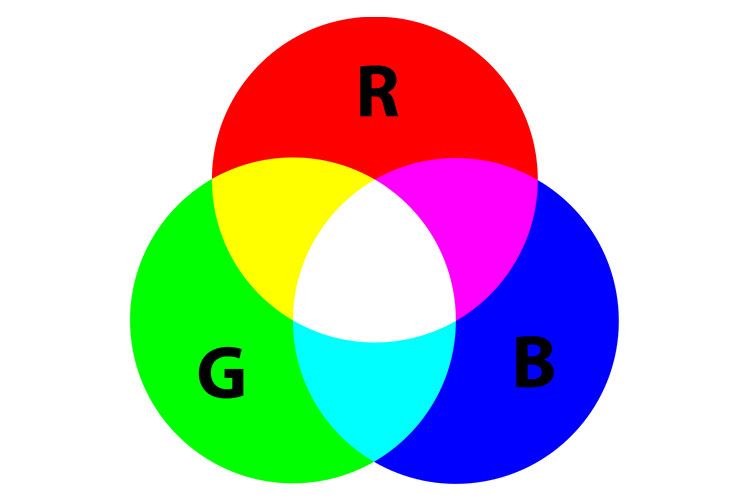
RGB stands for Red, Green, and Blue. This color system is called an additive color system, which means that with the addition of a primary color, the resulting shade gets brighter. The scale of vibrancy goes from 0 to 225. Mixing red, green, and blue in their highest vibrancy should then result in white.
For example, the green PackMojo logo you see on your screens is a composition of 81 red, 220 green, and 133 blue. Essentially, the mixing of these colors is done using light beams superimposed onto a screen. RGB is the color system for all things digital and is device-dependent since it is best viewed on a screen (TV, phone, laptop) and requires light to be viewed accurately.
For this reason, RGB isn't used in packaging.
What is CMYK?
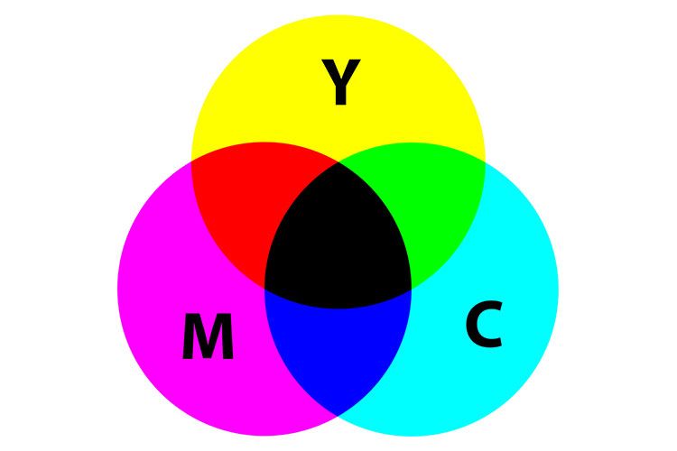
CMYK stands for Cyan, Magenta, Yellow, Key (Black). It is a subtractive color system. The color space initially starts with white. You mix the four primary colors in a particular ratio to give you the desired color. With every layer of a primary color you add, the brightness reduces. Mixing cyan, magenta, and yellow is said to result in pure black or key. For example, to make the green in the PackMojo logo, we would have to mix roughly, 55% of cyan, 34% of yellow, and 14% of key.
What is PMS?
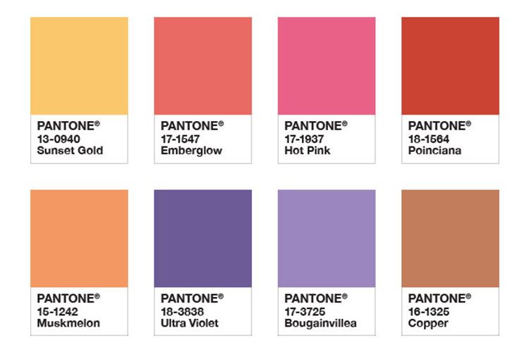
PMS stands for Pantone matching system or simply Pantone. These are premixed colors and have higher consistency and accuracy when printing. It is recommended to use Pantone colors when designing or printing brand logos or materials that need to match each other regardless of where they are printed. Think about the Tiffany blue, or the Coca-cola red - the print must be consistent every single time. In PackMojo's case, in order to ensure our logo is printed at the exact same shade of green, we would use Pantone 2268.
Every Pantone color has a code with either the letter ‘C’ (coated) or the letter ‘U’ (uncoated) at the end, signifying the paper to be used to print. Coated paper is used for high quality, sharp prints. It is usually the preferred choice for premium packaging, such as custom rigid boxes or custom folding carton boxes.
Uncoated paper is a coarse paper that absorbs more ink and provides a less sharp finish. It is great to use uncoated paper if you are looking for something rustic, such as a kraft mailer box. Similarly, the result of printing on uncoated paper would also resemble that of ink printed in the pages of a novel. Usually, if you pick kraft paper as your packaging material, we would use Pantone U to print on it, and for everything else, we would use Pantone C.
When should you use CMYK vs. Pantone
CMYK is recommended in the following cases:
- If you have home printing projects, it is best to use CMYK to get a better color match between the shade you see on the screen before printing versus the shade after it has been printed.
- If your printing budget is a concern, stick to CMYK. Since CMYK requires mixing only 4 inks, using this color system is cheaper, especially when there is a need to print multiple colors. Custom package printing is usually always done using CMYK colors for this reason.
- However, be aware that CMYK hues can vary slightly across different printing devices and print runs.
Pantone is recommended in the following cases:
- When printing logos or other branding materials, it is recommended that you use Pantone colors since they keep the colors consistent. Here is a good resource to look for Pantone colors and conversions from CMYK and RGB to Pantone.
- Pantone makes it possible to access colors like neons that CMYK cannot accomplish.
- Keep in mind that Pantone is more expensive than CMYK since it is pre-mixed before the printing process.
How do you make use of CMYK in packaging design?
The CMYK color system plays an important role in packaging. In fact, for economical and accurate printing of your packaging material, it is best to rely on CMYK.
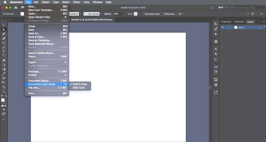
Here's how to select CMYK mode in Adobe Illustrator:
- Open Adobe Illustrator.
- In the menu, click on 'File' --> click on 'Document Color Mode' --> select 'CMYK Color'.
Here's how to select CMYK mode in Adobe Photoshop:
- Open Adobe Photoshop
- In the menu, click on 'Image' --> click on 'Mode' --> select 'CMYK'.
If in case you already have a design in RGB format, you can always convert it into CMYK. Be mindful that the colors may look different once converted. You might need to tweak them manually to get your desired color.
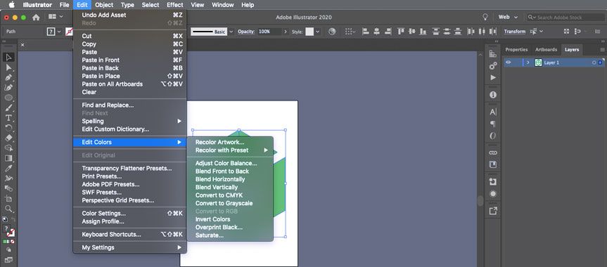
Here's how to select convert RGB to CMYK in Adobe Illustrator:
- Open Adobe Illustrator.
- In the menu, click on 'Edit' --> click on 'Edit Colors' --> select 'convert to CMYK'.
Here's how to select convert RGB to CMYK in Adobe Photoshop:
- Open Adobe Illustrator.
- In the menu, click on 'Edit' --> click on 'Convert to Profile' --> click on the dropdown menu next to 'Destination Space' and select 'CMYK'.
Now that you have a good idea about the different color systems and how they can be used, get started on designing your packaging that wows your customers!
Looking for some design inspiration? Check out our packaging design showcase page.