Why do colors look different on screen than when printed?
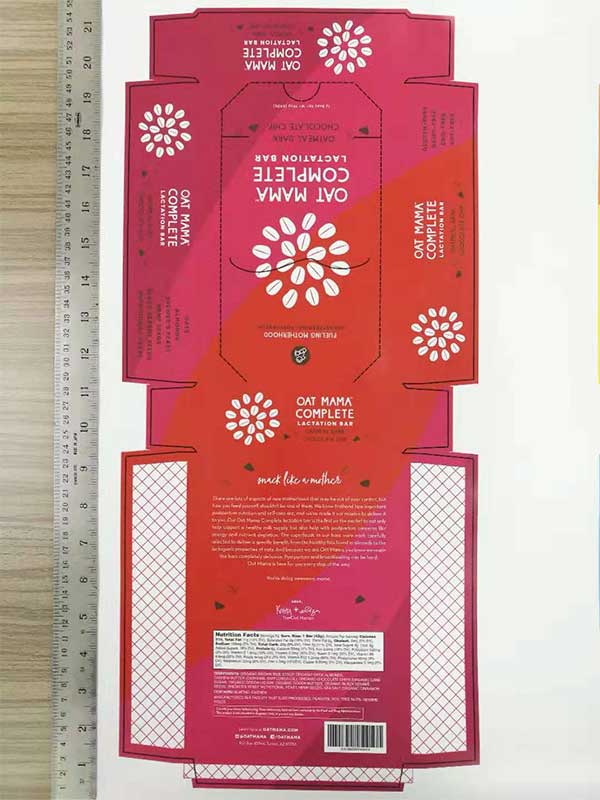
When it comes to your packaging, colors are an important part of your overall branding. If you've ever printed out something using your home printer, you probably noticed that the colors came out slightly duller than when you viewed it on screen. Here, we'll share the differences between the color systems, other factors that affect the outcome of your print, and how to ensure your brand colors are represented accurately and consistently when going from screen to print.
Color System Differences
Colors you see on screen will look differently to colors that have been printed out.
On screen
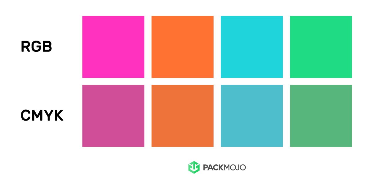
Colors on screen are based on the RGB color system. These colors are created by mixing 3 colors of light beams together - red, green, blue. RGB colors can only be displayed digitally on screens (e.g. computer monitors, smartphones) because they are made with light.
In print
Colors in print are usually based on the CMYK color system. These are process colors that are created by mixing 4 colors of ink together - cyan, magenta, yellow, and key (black). These are the exact same colors as the ink cartridges in your home or office printer!
In addition to CMYK, another popular color system is called PMS (Pantone Matching System) - or simply Pantone for short. These are spot colors and are pre-mixed ink that's primarily used for very specific brand colors (e.g. Tiffany's blue), and for colors that are difficult to create using CMYK (e.g. very bright colors, metallic colors). Pantone colors are more expensive than CMYK, and are ideal if you need consistent and accurate colors for every print run.
Screen & Software Differences
CMYK colors on screen vs in print
When designing your packaging on a dieline template using Adobe Illustrator, be sure to set the document color mode to CMYK. This will be the closest representation of colors that you see on screen vs what's actually printed. In Adobe Illustrator, there are also additional settings to adjust the color profiles of CMYK, all of which may look slightly different.
Important: although you may be viewing CMYK mode on screen, these are still colors that are created by light, meaning that CMYK on screen will look different to CMYK that's been printed. You are essentially viewing a RGB representation of CMYK colors. Therefore it is important to recognize that the colors will all be slightly altered.
Screen & software differences
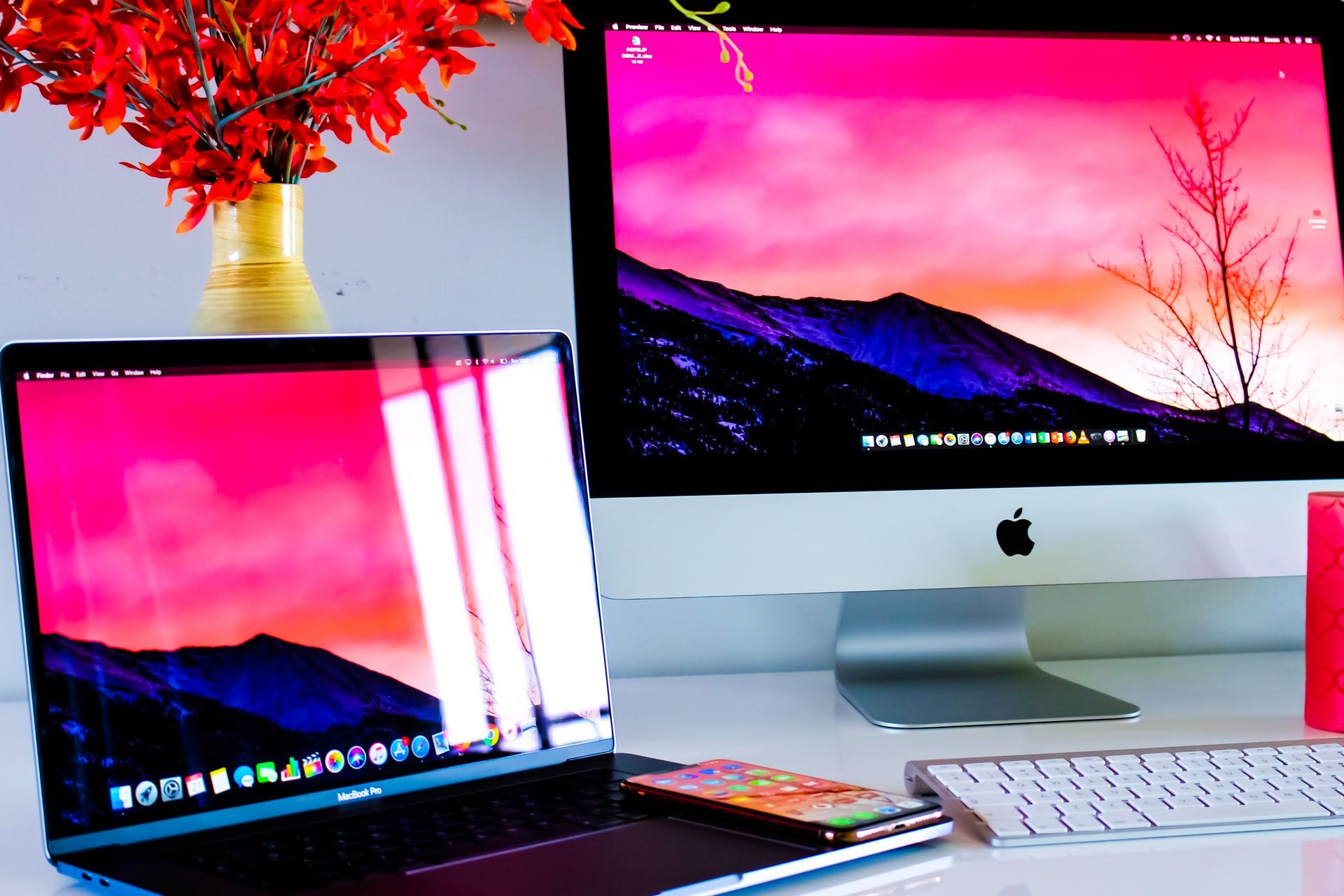
By simply adjusting the brightness, contrast, or applying a night-mode filter to your device, colors will instantly look different. There will also be differences across device types and models - colors will look slightly different on an iPhone vs a Lenovo laptop vs a TV.
Lighting Differences
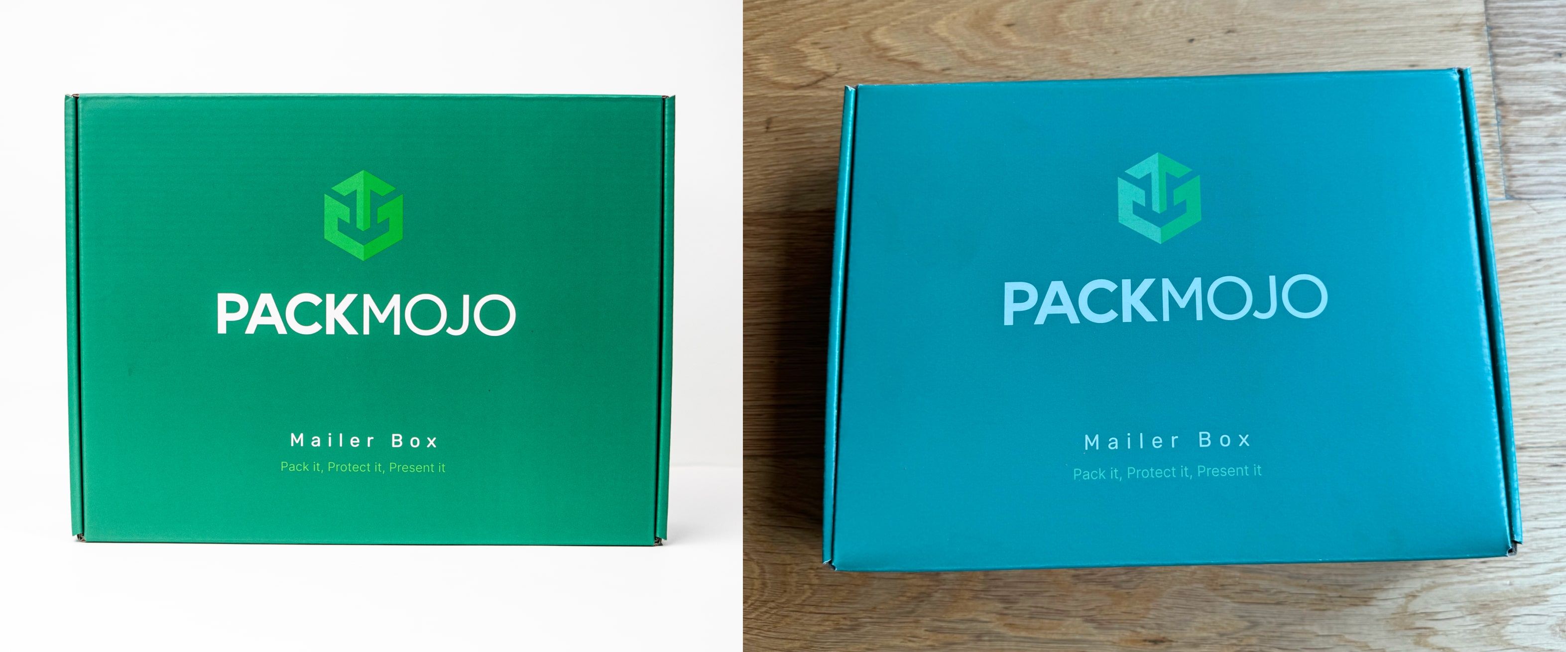
Our eyes perceive color through viewing reflections of light. Therefore, packaging colors may appear differently depending on the lighting circumstances of the environment. For example, the PackMojo box here is the same box. However, one is shot in professional white lighting whereas the second photo is photographed under different lighting. Though the box itself appears to be more like the first photograph when seen in person, it can appear almost blue in photographs as a result of the photograph and viewing the photograph through a screen.
Also do note that when you are viewing an image of a box, you are essentially viewing a RGB colored photograph of a CMYK-printed box, therefore the colors are ultimately going to be slightly different than reality.
Paper Material Differences
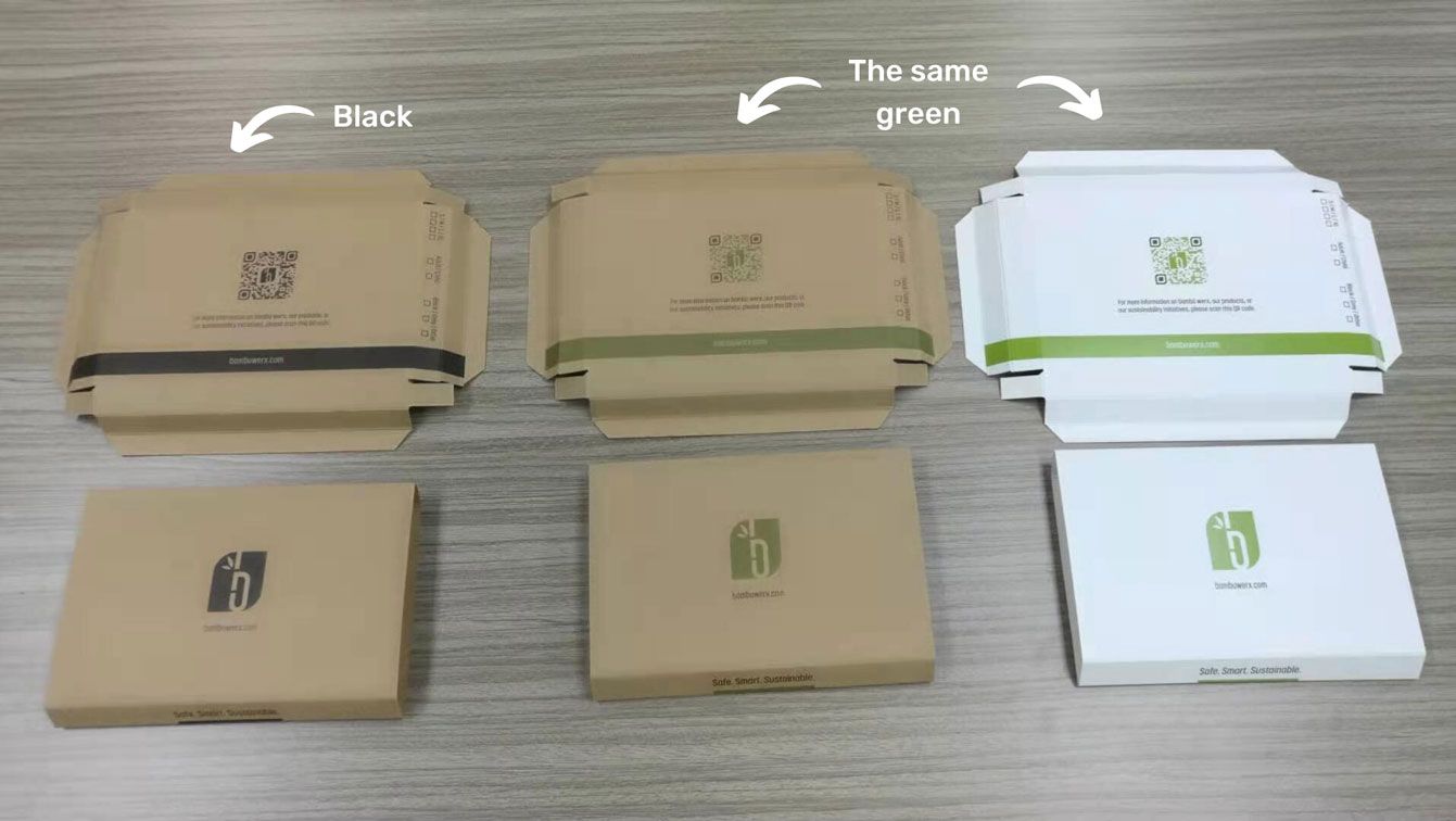
The base paper material (substrate) that your artwork is printed on can affect how colors will look.
- Bright vs dull white paper: colors will look more vibrant on a brighter base material
- White paper vs brown kraft paper: colors will look duller when printed on a brown kraft material
- Textured or uncoated paper: these materials are more porous, so ink may be absorbed differently across the same piece of paper, leading to uneven print.
- Coated paper: since there's a coating, ink will not be absorbed into the base material, and instead be printed evenly on the coated surface, leading to more crisp print.
Note: PackMojo uses coated paper for white materials and uncoated kraft paper for kraft materials. If you'd like to use textured paper or uncoated materials, please do keep in mind that this could affect the outcome of print.
Printer Differences
The type of printers used can also affect the colors and quality of print:
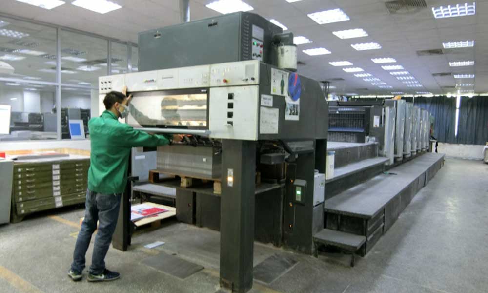
- Offset printers: ink is transferred from a metal plate to a rubber sheet, which is then rolled onto the substrate paper. Yields the highest quality print in terms of color, sharpness, and crispness.
- Flexo printers: ink is transferred from the plate directly to the substrate (similar to stamping a piece of paper). Print quality is lower than offset printing and is difficult to print detailed designs and multiple colors.
- Digital printers: uses toners and cartridges, similar to a home or office printer, and only supports CMYK (no Pantone). Difficult to achieve consistent quality and color accuracy compared to offset printers.
Note: PackMojo primarily uses offset printers for printed packaging. Digital printers may be used for smaller items such as printouts and business cards.
How to ensure color accuracy and consistency
When creating branded materials or artwork, be sure to have different color options for on screen assets (e.g. brand colors on your website) and printed assets (e.g. brand colors on your packaging).
As a starting point, ensure using the CMYK color mode when you're designing your packaging or printed materials. We'd also suggest following our dieline design tips so that your artwork files are production-ready.
Print Proof
Given all of the factors that can affect the colors of your printed materials and packaging, we'd suggest purchasing a print proof before production. This is a 2D printout of your design on the exact material that's to be used for your packaging. Once the print proof is approved, our team will match the colors printed in production to the colors of proof allowing you to get colors accurate to those on the print proof.
Note: print proofs are only available in CMYK and are not available for white ink and Pantone colors.
