The Ultimate Guide to Colors in Packaging
This page curates all content related to colors when it comes to designing and printing packaging. Learn about different color systems, how to ensure you get the right color for designs, and much more.
Understanding Color Accuracy
Everything you need to know about achieving and measuring color accuracy in packaging.
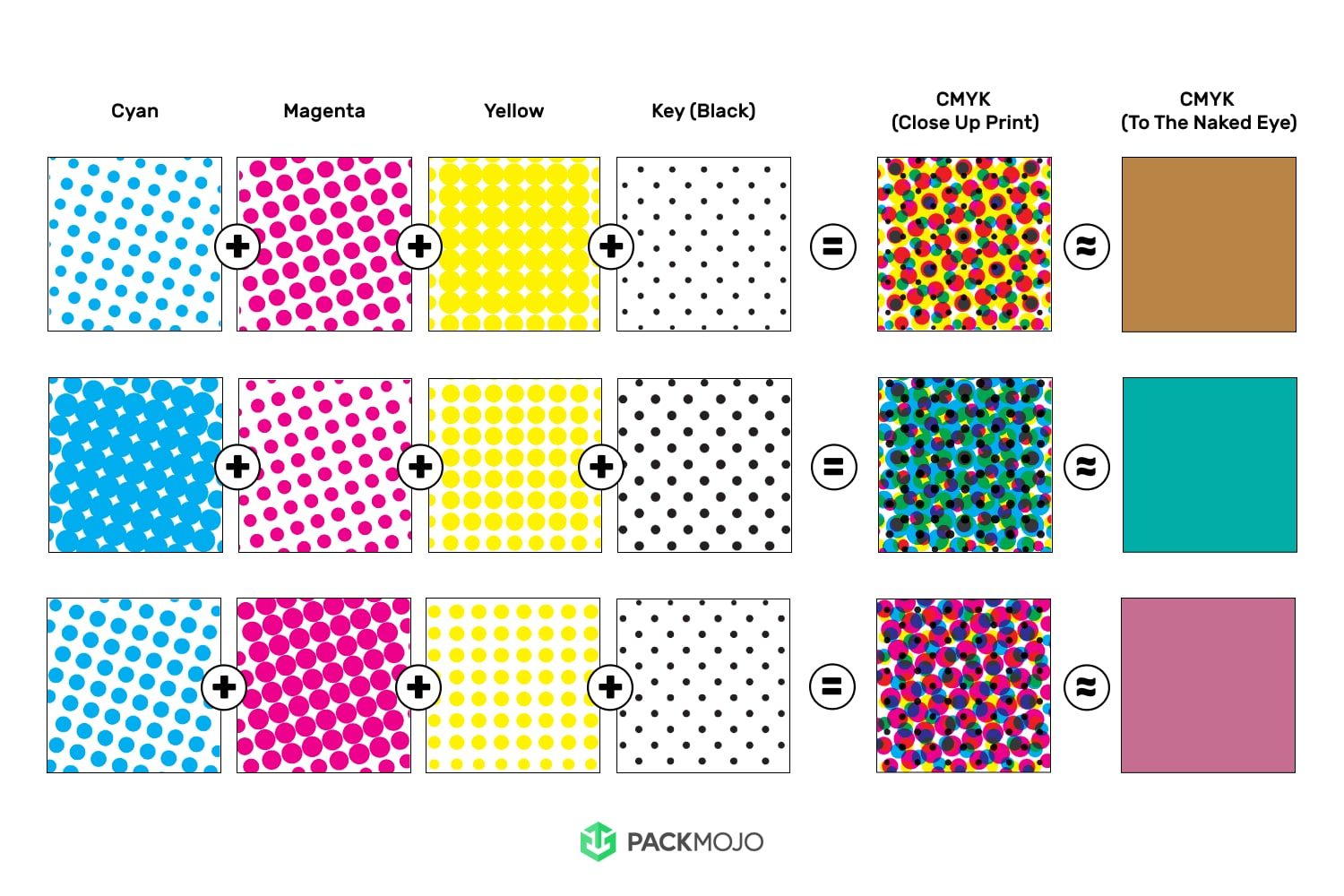
Comparing Universal Color Systems
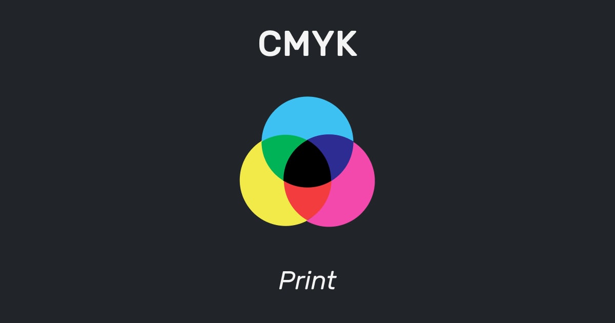
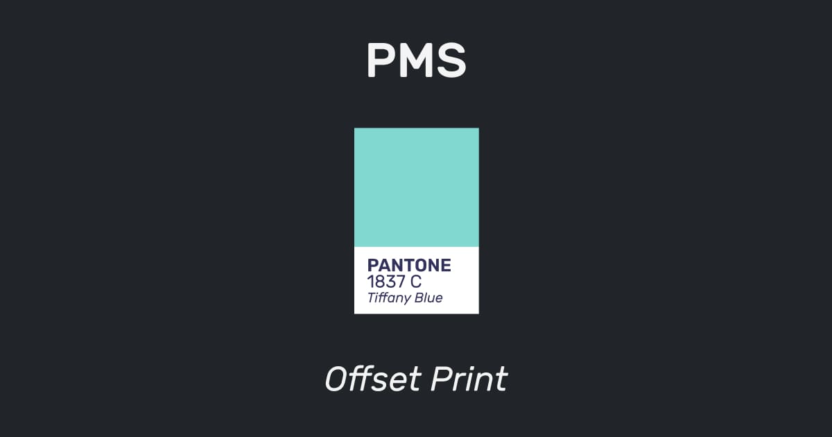
When to use RGB, CMYK & Pantone
Learn about when to use RGB, CMYK & Pantone for design and how to make use of it in Adobe Illustrator for packaging design here.
Frequently Asked Questions
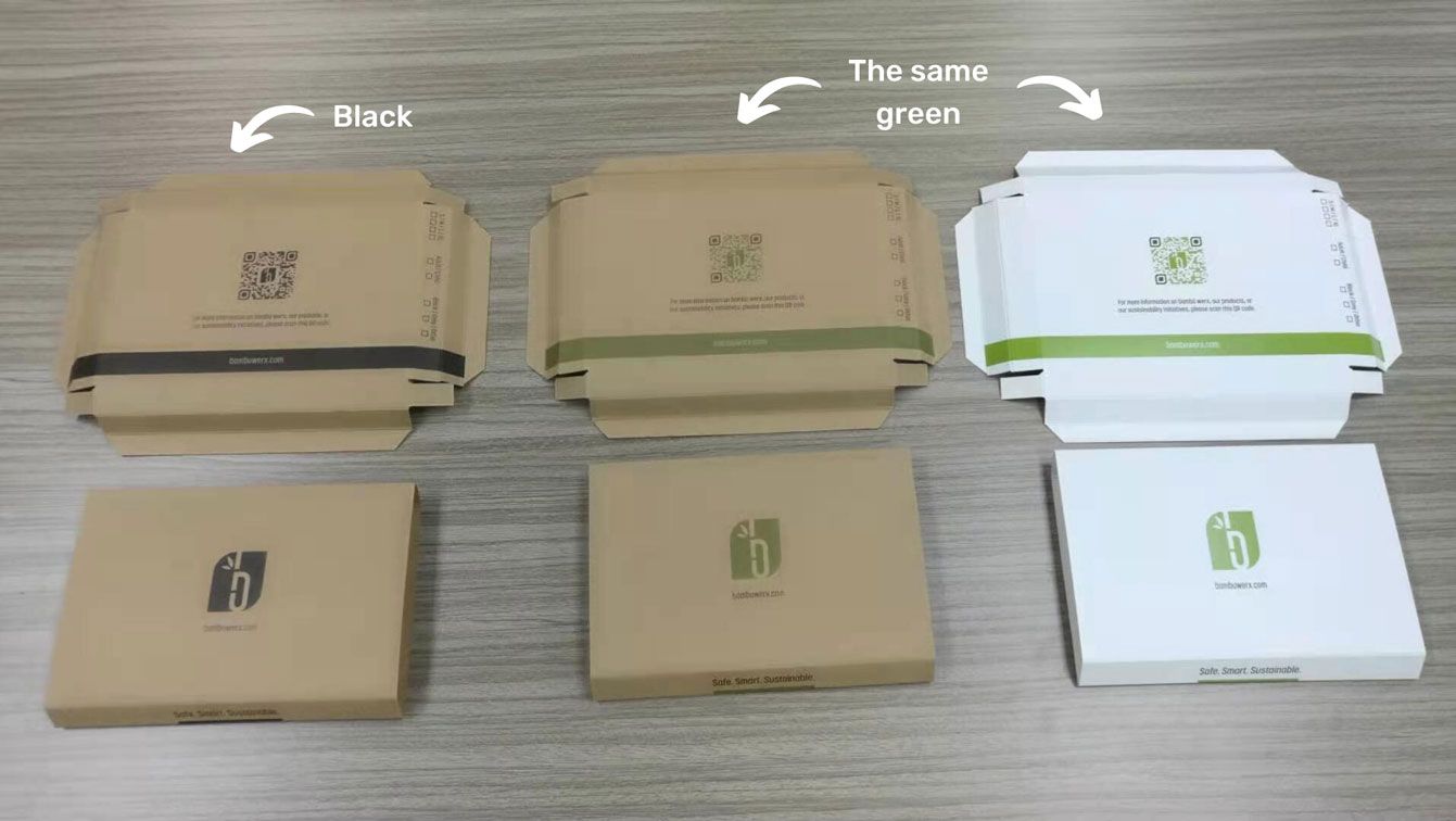
How do colors look when printed on kraft paper?
Colors tend to look duller when printed on kraft paper. When printing on kraft, we strongly suggest black or white ink to ensure it comes out nicely. Here are some examples of how other colors look when printed on kraft paper.
What colors can I print in?
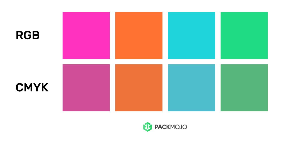
Why do colors look different on screen than when printed?
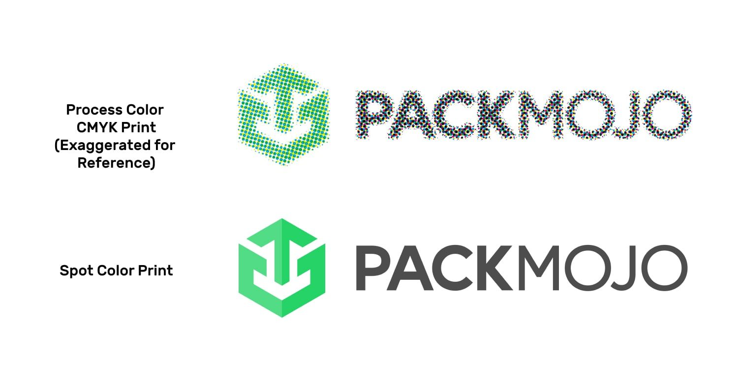
When should I use CMYK colors (process color) and Pantone colors (spot colors)?
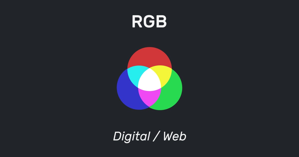
What are the differences between RGB, CMYK and Pantone?
Will it cost more to print in Pantone?
