Embrace warmth, intention and tactile discovery; these five stationery packaging designs elevate presentation, protection and personalization all at once. Here are the standout examples featured:
- Crane – Elegant rigid boxes with subtle engravings and layered colors convey intimacy and minimalistic refinement, creating the urge to write something heartfelt instead of sending a generic email.
- The New Zealand Public Service Association – Bold stationery packaging in soft pink, white and copper addresses the gender pay gap, using custom inserts as visual metaphors for social molds.
- Louise Fili Brillante Pencils – Vintage-inspired rigid boxes with glossy accents and richly patterned design make adult creativity feel sophisticated and nostalgic.
- MH (Handmade Memories) – Tray-and-sleeve packaging in soft lavender and cream, with a ribbon pull, honors the handwritten letter and treats each sheet gently.
- AJOTO – Cork-sleeved stationery packaging that doubles as a pen rest when open, combining sustainability, function and aesthetic charm.
To build a strong and sustainable relationship with customers, it’s important to humanize your brand. One of the simplest ways to do that is thank your customers for choosing your company to help them with their needs or implement certain designs within your products that will resonate with your audience. The COVID-19 pandemic has drastically limited human interaction. Therefore, the next best thing to show people we are thinking about them has been personalized gifts and messages. Here are 5 of our favorite stationery packaging designs that have delivered many smiles upon people’s faces.
Crane
There’s nothing like writing on a crisp and clean slate of paper. The quality of the paper and the message written on it work hand in hand in delivering a pleasant experience to its recipients because they will be able to see the care, thought, and personalization that went into crafting the message.
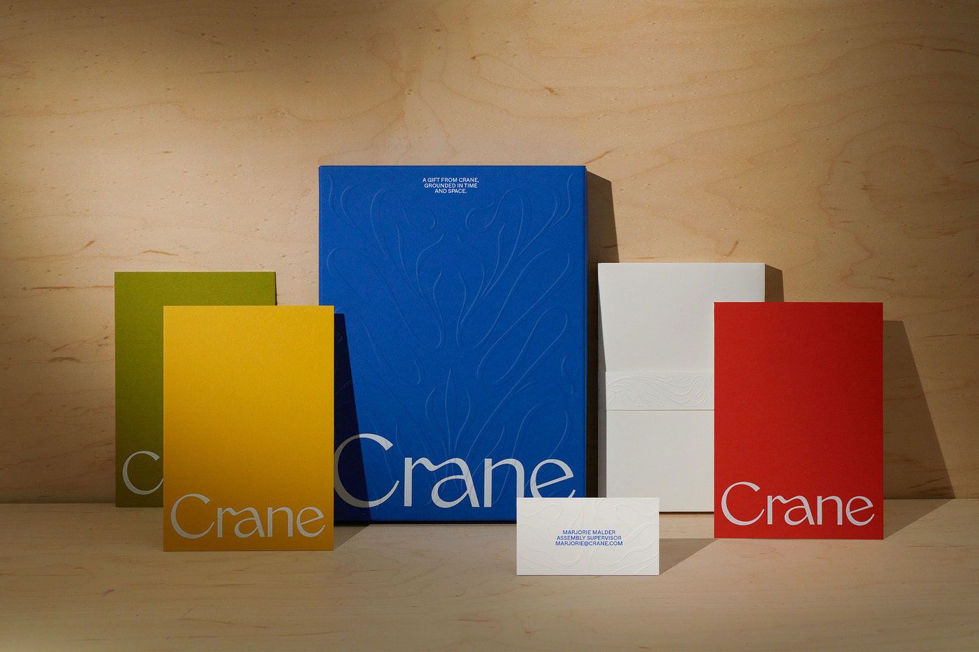
The beauty of Crane’s packaging is that they understand the intimacy a physical message can bring especially during these technologically advanced times. So they revamped their packaging and crafted new rigid boxes that will not only protect their stationery items but also create a strong presence in office spaces and retail shelves. They utilize engravings and secondary colors on the packaging to provide a sense of warm and inclusive elegance alongside its striking new minimalistic look.
Crane’s new packaging design allows for its stationery to stay in pristine quality and invites you to sit down and write a personal message over sending a generic text or email. Say goodbye to dull printer paper trays and hello to Crane’s new stationery boxes.
The New Zealand Public Service Association
You know what’s better than aesthetically pleasing stationery? Stationery with a purpose. The New Zealand PSA decided to design stationery packaging that targets the gender pay gap in New Zealand. The sleek and ironic use of “soft pink,” white, and copper was to portray the outdated gender norms and the pay imbalance between men and women in the workforce.
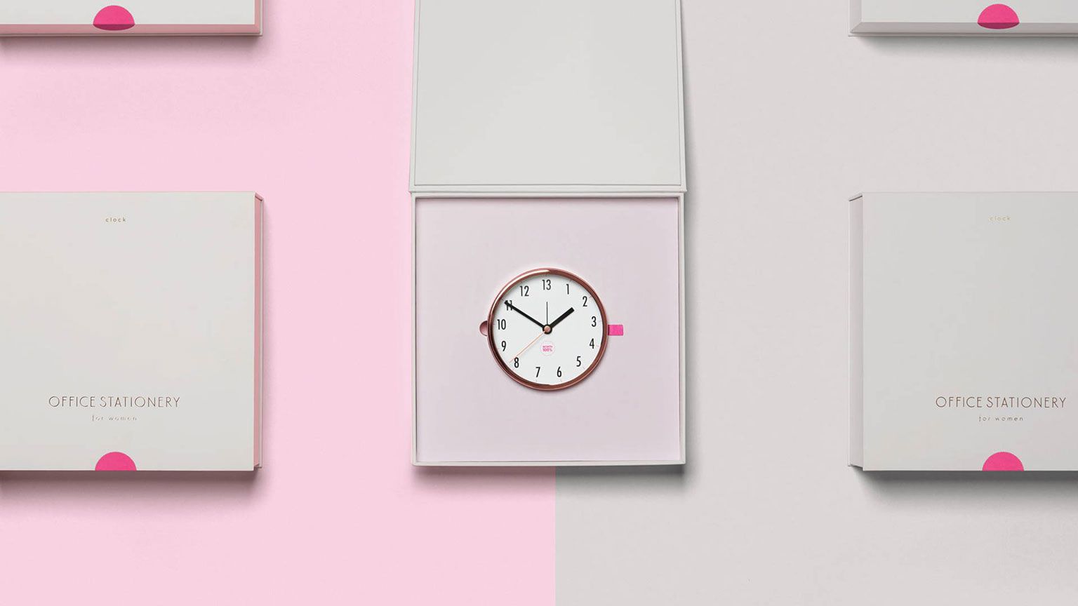
They also use custom box inserts to show how easily women are forced into a mold that society has created for them. The packaging of their stationery products not only brought awareness to a significant issue, but also empowered women and instigated a movement for equal pay.
Louise Fili Brillante Pencils
A great way to add a little flair to your personalized messages is a pop of color. Louise Fili Brillante Pencils are geared towards adults, giving them a vessel to tap into their creative endeavors. These pencils are contained in a rigid box, giving them maximum protection and easy storage.
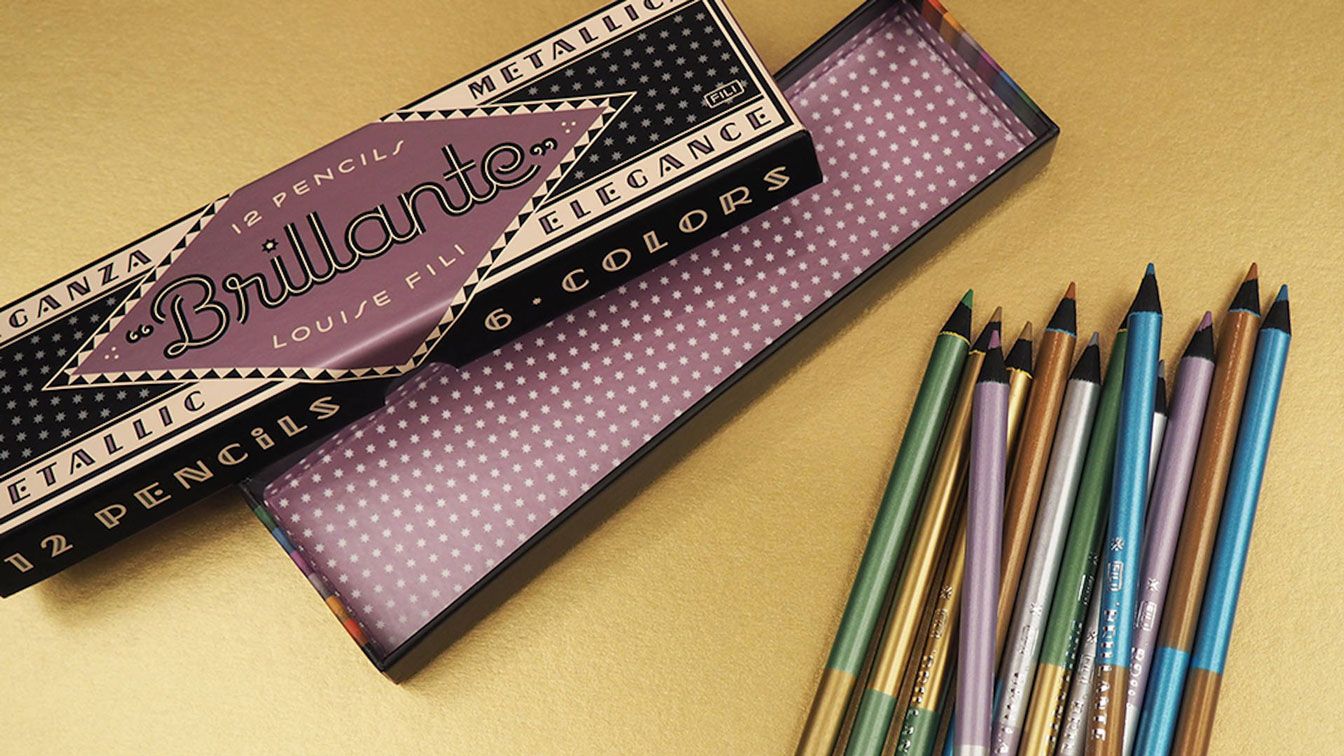
The packaging offers a delightful twist to classic Italian packaging as it provides a vintage feel through its selection of fonts, patterns, and colors and has subtle hints of sheen to complement the metallic pencils. Although colored pencils have been deemed as children’s writing utensils, the sophisticated packaging of the Brillante Pencils have opened the doors for adults to choose imagination and fun.
MH - Handmade Memories
MH Studios wanted to create packaging for their stationery that showed the value of a hand-written letter and the care that goes into a personalized message. Their brand is signified through their primary colors of lavender and cream to portray a modest and refined composition, while the gold logo exudes a premium presence.
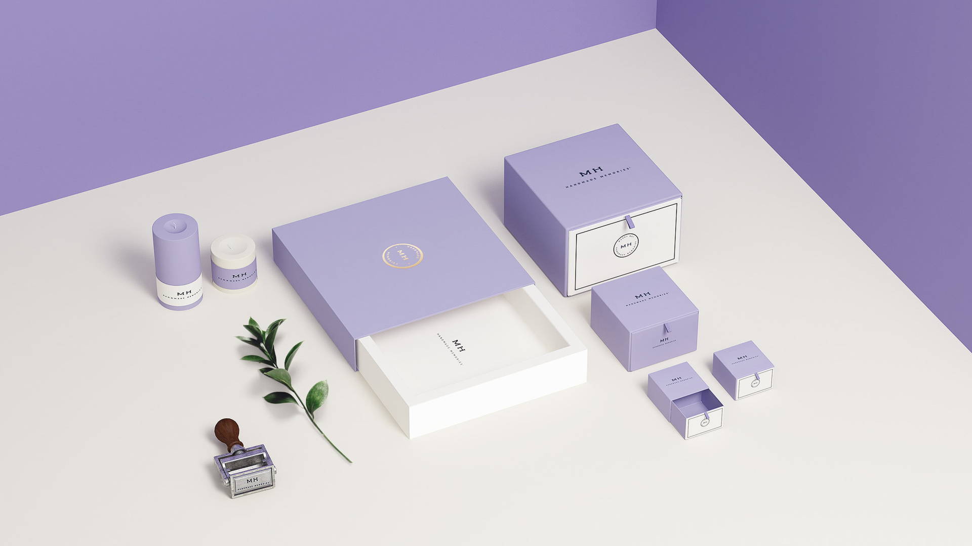
Custom tray and sleeve boxes are used for their stationery because this allows for the user to easily access any of their paper products from shelves or their desks while protecting the quality and integrity of the contents. A great detail to mention as well is the ribbon inside the packaging which allows for the selection of individual sheets of paper without wrinkling them. The overall packaging is very well thought-out as it is respectful to the user experience when it comes to crafting a physical memento.
AJOTO
AJOTO’s new cork packaging was created so the user could have a more practical and engaging opening experience with the product. The package exterior structure is a white paper encasing while the interior is the pull-away sleeve container that is made out of cork, giving the overall package a striking contrasting aesthetic.
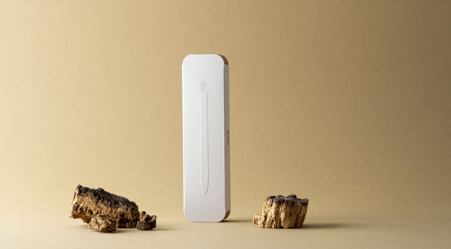
Cork is a great sustainable material to use in packaging as it is light, renewable, biodegradable, and recyclable. The package was also designed with two purposes in mind: pen storage and pen rest. When the pen is in use, the opened box can be turned over and the pen can be gently rested inside the mold created. When finished, the pen can be stored away and the box can rest beautifully anywhere.
A writing vessel is a necessity when it comes to writing personalized letters, so why not use a pen that gets the job done and positively impacts the environment?
--
Check out some of our other weekly favorites:
