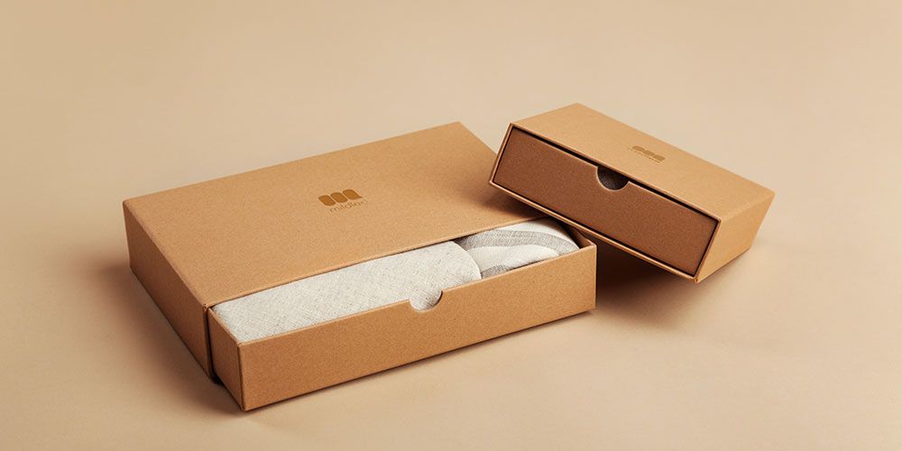
The KISS (keep it simple, stupid) principle states that sometimes designs work best when they are uncomplicated and easy to understand. This goal of simplicity holds true even when it comes to designing packaging. Minimalism has gained a massive following over the last few years, though it was originally introduced in the 1950s. The less is more mantra has proven to be easy to use and effective in attracting people without compromising on aesthetic appeal.
Whether it’s being minimal in the artwork on the packaging or the design of the box itself, minimalism can add an element of purity, sophistication, and elegance while keeping the quality and efficiency intact. Below are 5 best practices to consider when designing minimal packaging.
1. Focus on the logo
Minimalism focuses on what is needed and when it comes to branded packaging, your brand logo is not to be missed. You can opt to put only your logo and a plain background to maintain focus on it. This way your customers will likely remember it better and in general, makes your brand more identifiable among thousands of others that exist in the same industry as yours.
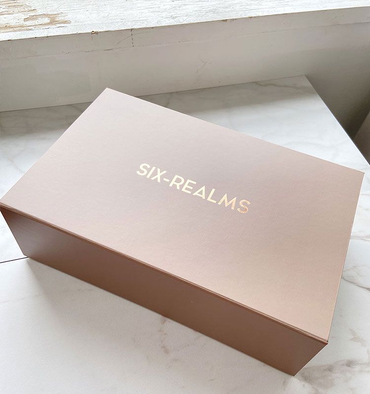
Six Realms opted to go for a gold foil stamping of their logo on a plain background. Not only does the gold color stand out, but also maintains the customer’s attention on it. The box looks sleek and sophisticated aligning with the brand value.
2. Monochromes
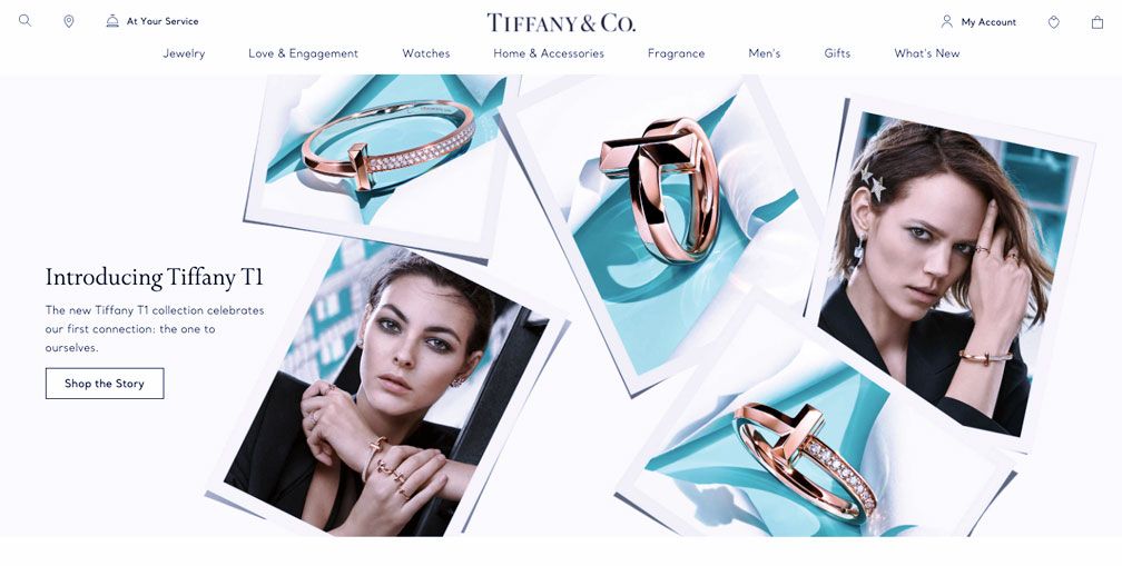
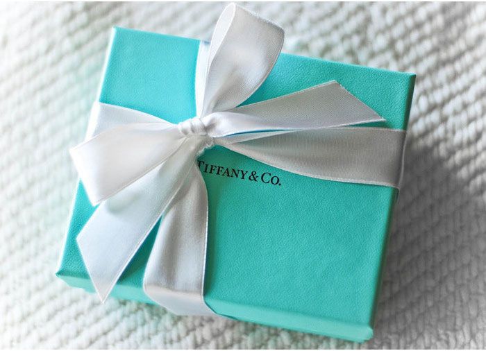
If your company has a brand color or shades that you usually include in your products and/ or social media posts, it is always a good idea to translate it into your packaging. For example, you are likely to associate the color teal with the unforgettable Tiffany’s box. They not only incorporate this color into their packaging but also their website and Instagram pages. Similarly, you can also include such vibrant colors in your packaging.
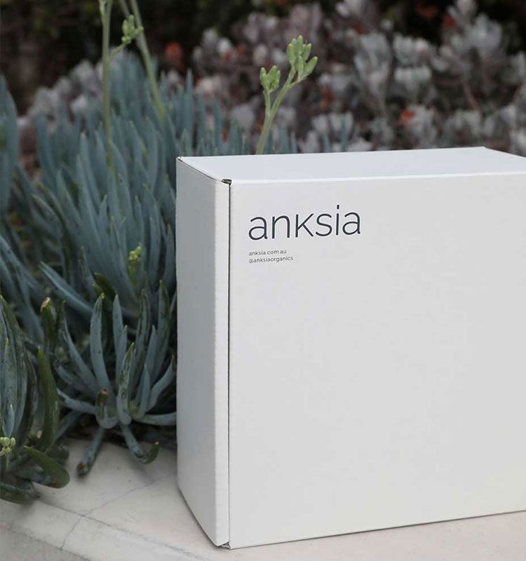
While bright color might be a good choice, don’t hesitate to stick to white monochrome palettes. White is often associated with minimalism and is a sign of purity and positivity. Anksia is one such brand that uses white boxes to depict its brand values of simple luxury, which is tactile yet approachable.
3. Clear / see-through packaging
If you want the color and an element of excitement while keeping your packaging minimal, try out clear or see-through panels. These give your customers a sneak peek into your product and make for a great unboxing experience.
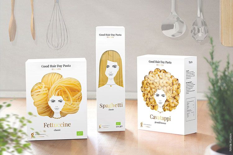
This creative concept titled ‘Good hair day pasta’ by Greenomic uses a simple white folding carton box with a see-through window to give customers a look at the kind of pasta contained in the box. With the creative use of the window, the product is highlighted and there is no need to include added elements to the packaging.
4. Less material
Minimalism can be incorporated not only into the artwork and aesthetic of your packaging but also the materials that go into making the boxes. Using less material helps you save costs, reduces the amount of waste produced while making it, and helps your customers be more sustainable. Kraft boxes are your best bet if you want something aesthetically pleasing but also eco-friendly. Win-win!
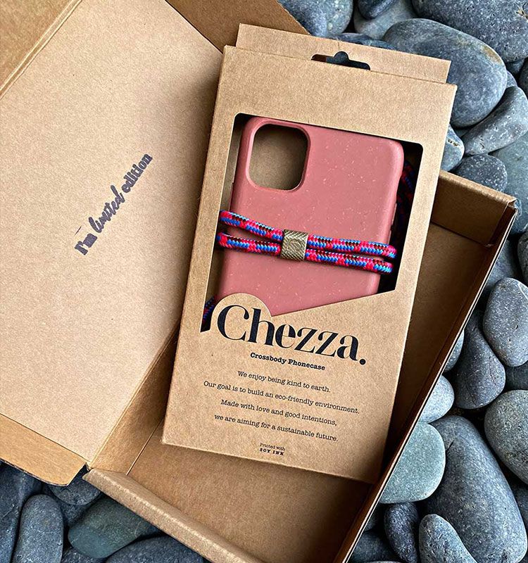
Chezza uses kraft boxes with just their logo printed using soy-based ink. This makes the packaging 100% recyclable. The cut-out window in the box makes the packaging perfect for retail display.
5. Display exactly what is needed
In order to be minimal, it is important to weed out all the unnecessary elements of your packaging and essentially clean it up. This could mean cutting down on colors, removing irrelevant information, etc.
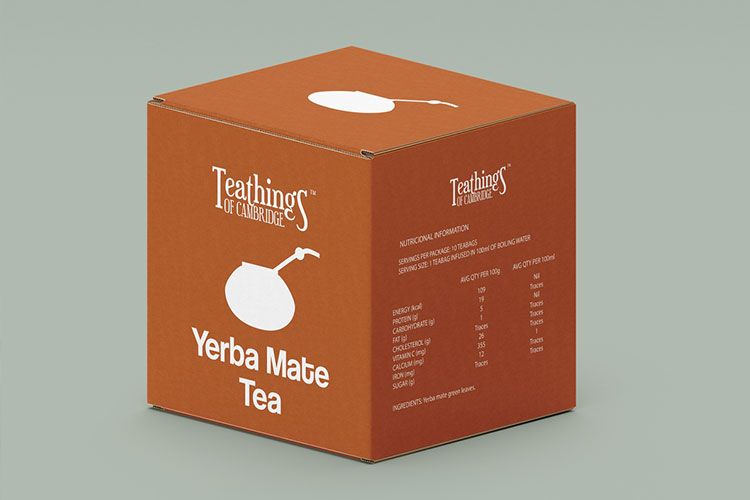
In the case of this tea company, the only thing included on their box is the name of the product and the ingredients. This tells the customers exactly what they need to know without them having to look for it.
Minimal packaging continues to be a theme that is increasingly being included in many areas including packaging design. If you do want to go for something minimal, keep these best practices in mind. Get inspired and get started on your packaging today!
