When designing custom boxes, you want to put all your marketing and branding material on them. Your logo probably takes the key spot, center front of the box, or the center top, but another important part of the design is the font. You not only want a catchy tagline but also for the words to be legible and comprehensible. The typography needs to catch the customers' eye, and the branding tone and message needs to convert potential customers to loyal ones.
In this article, we are focusing on typography and how you can use it to ensure your packaging is not only attractive but also memorable and recognizable.
1 - Type of Font
The type of font you use makes a huge difference in the design and look and feel of the packaging. Think about your brand tone and image, is it fun? Is it serious? Fonts also express emotions and ideas. For example, if your brand image is fun and colorful, it goes without saying that your packaging design would have a lot of bright colors and patterns. Another inclusion to the design could be to include a serif font or a decorative font. This portrays your brand image as cheerful as opposed to if you used a serif font or calligraphy which would make it seem out of place and confuse the buyer.
Typefaces typically come in 4 different types.
1 - Serif fonts
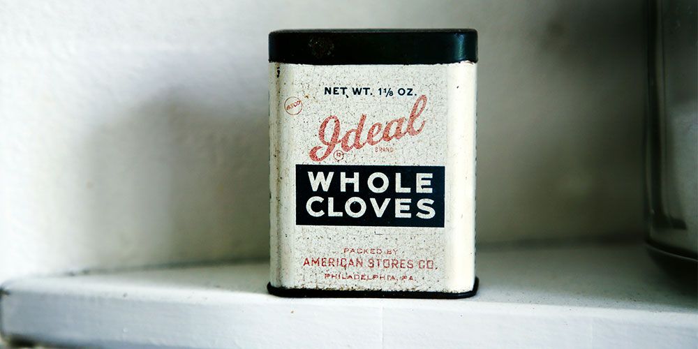
These fonts are the oldest type of fonts. The look and feel are classic and serious. One of the most classic examples of a serif font style is Times New Roman. This kind of font is best used for newspapers and books, although there are now many more options to choose from when creating professional, well-designed visual content.
2 - Sans Serif Font
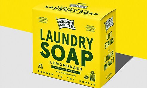
‘Sans’ means ‘without’. Sans Serif fonts don’t use the lines at end of the letters as seen in serif fonts. One of the most common places you will see a sans serif font is advertisements in the 1800's. These fonts definitely portray a more informal tone and feel.
3 - Decorative Font
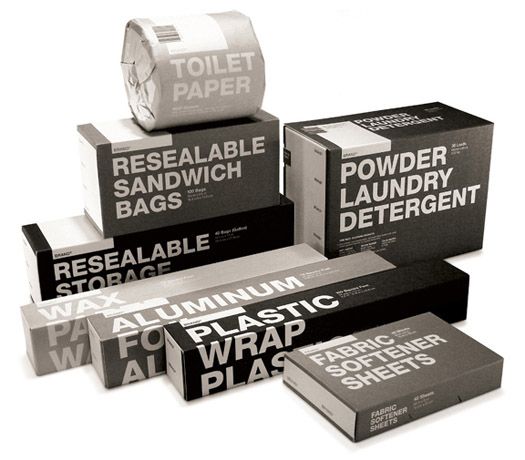
This kind of script is a diverse class of different types of fonts, including, grunge and stencil type texts. These typefaces give you more freedom in using them for all kinds of brand tones.
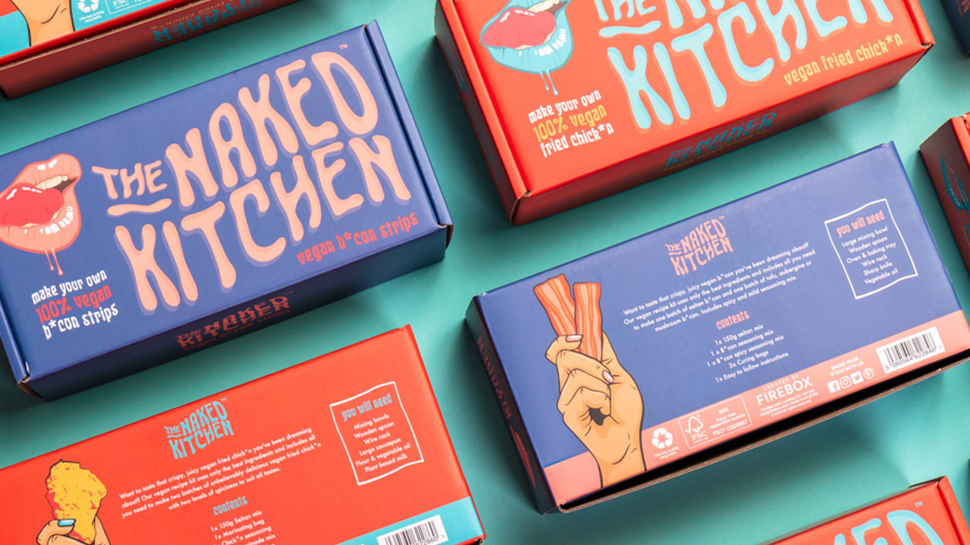
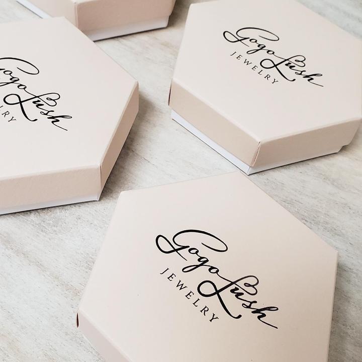
4 - Script
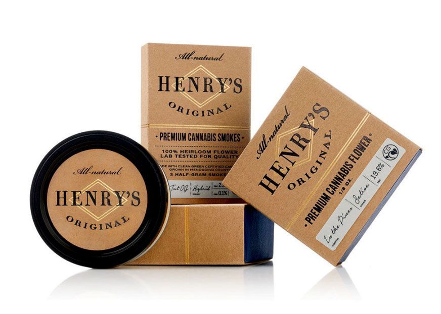
Script font resembles handwritten calligraphy, cursive, or other fonts. With this type of typeface, the feel is warmer and hints at a personal touch to the packaging. Cursive handwriting fonts also exude elegance and luxury.
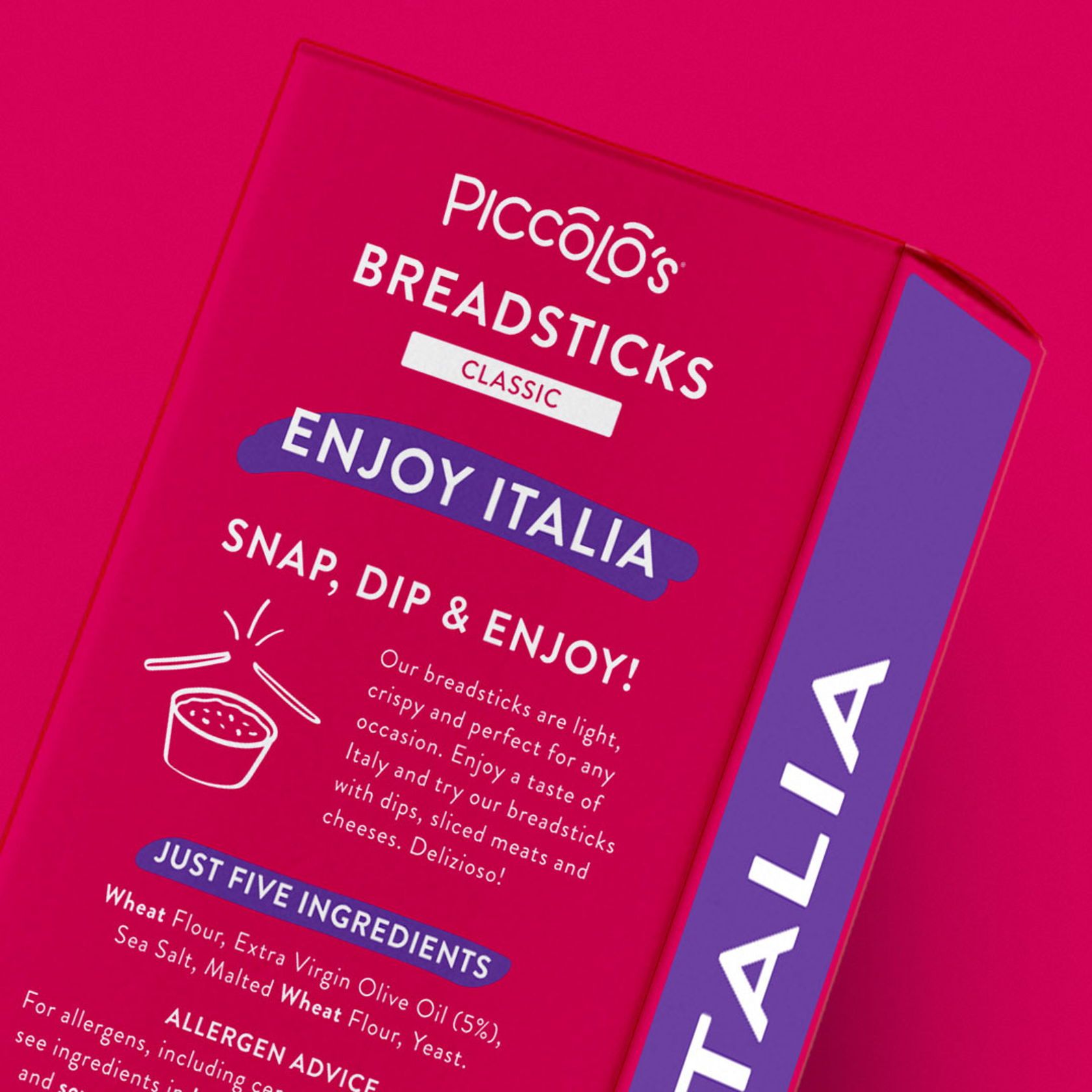
2 - Size of font
Don’t lose your font in the other elements of your packaging. It should be prominent, but also not overpowering that it takes away from the other branding elements. Keep in mind a hierarchy of the most important words, for example, your brand name, which should be the boldest and largest. Following this, the other details, for example, hashtag, tagline, social media handles, should be in a smaller, yet legible font.
3 - Include only what is necessary
It's easy to get overwhelmed with the amount of information you want to include on your packaging. You want to give your customers as much information as possible for them to know everything about your product and your brand. This can lead you to compromise on other elements such as the size and type of font. You want to stand out from your competitors. As much as the right type of typography and size is important, so is the amount of information you put on your packaging. With the emergence of minimalism as a packaging trend, it can be important to consider only including key information.
Yes, your customers want to know about the product, but probably don’t need to know about other similar products through your packaging. You can always use other forms of marketing to talk about your wider range of products. However, if you have a subscription box business, then including information about your eco-friendly products or each product included in the box might help attract more customers.
When designing packaging with Adobe Illustrator
If you use a tool like Adobe Illustrator to design on your packaging dieline, there are some important things to remember.
- Make sure to outline or vectorize your text. This will ensure that when your printers open the file, they are not missing any font files.
- Typically, the minimum text size is 6pt. If you want to include text that is smaller, make sure to let your packaging suppliers know so they can ensure the printing is done right.
For more tips on designing dielines for your custom boxes, check out our dieline design tips.
If you'd like to explore custom packaging option, take a look at our custom packaging options or begin configuring on our platform today!