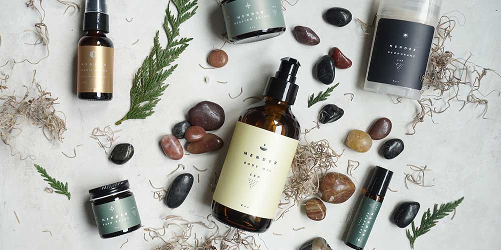
Clean lines, subtle tones, and thoughtful materials—these minimalist skincare packaging designs prove that less really can be more. Here are five standout examples where branding meets elegance without excess:
- Twiggie & Rose – Crafts folding carton boxes in vintage tones, with detailed tuck-flap design and subtle rose-gold foil stamping for a refined yet natural unboxing feel.
- Skinsmiths – Uses folding cartons printed in various skintone shades on uncoated board, then adds a gloss overlay to mimic the feel of skincare application.
- Henua Organics – Presents its premium organic products in sturdy rigid boxes with magnetic lids and custom-cut inserts, featuring sleek black-and-white minimalism.
- Wildsmith Skin – Packages items in custom-printed cardboard tubes made of natural uncoated paper, printed in simple black ink for an eco-friendly yet striking appearance.
- Two22 – Delivers personalized serums in clean white folding carton boxes, enhanced with foil-stamped logos and embossed outlines, plus a burst of color inside.
For skincare & cosmetic brands, one of the most important parts of building trust with customers is to have good quality products. Because these products come into direct contact with our skin, there's no room for error.
Cosmetic packaging is a significant aspect of the beauty industry, serving to protect products while also showcasing their allure. It often plays a big role in consumer decisions due to its visual appeal and functionality.
Equally as important as having good quality skincare products is the packaging that comes with it. Given your customers will interact with your packaging first, it's imperative that the quality of your packaging matches that of your products.
After all, if your packaging doesn't impress customers, what will they think about your product?
When it comes to your own skincare packaging, think about how you can tell your brand story and values. Get creative with different font styles and choose colors that easily help customers identify your brand.
To give you some inspiration, here are our top 5 favorite minimalist packaging designs for skincare brands.
Twiggie & Rose
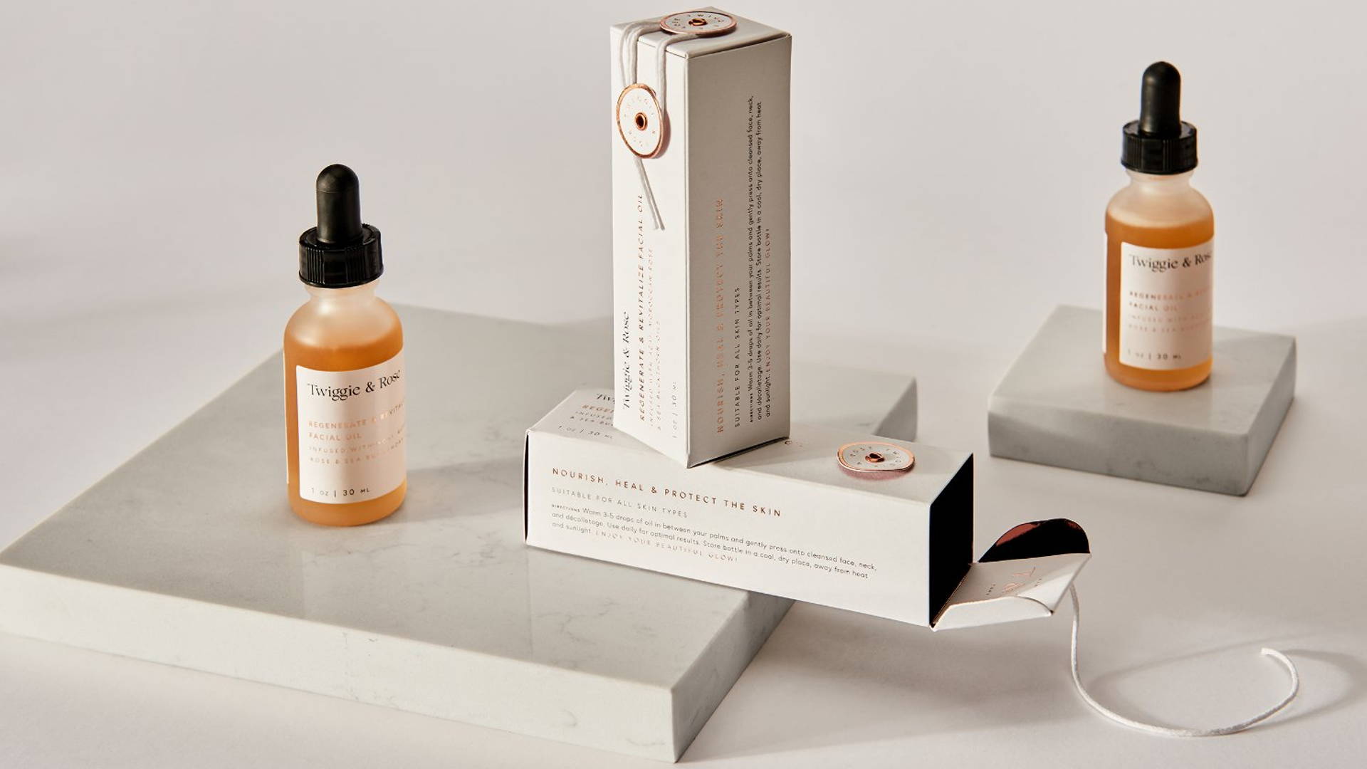
Twiggie & Rose is a natural, organic, and high-performance skincare brand. The folding carton box design in a vintage color pairs beautifully with the logo and fine image prints as a subtle and feminine brand. The detailed top tuck flap also gives customers a unique way of unboxing. They've also used rose gold foil stamping, giving their packaging a subtle, sophisticated look.
Skinsmiths
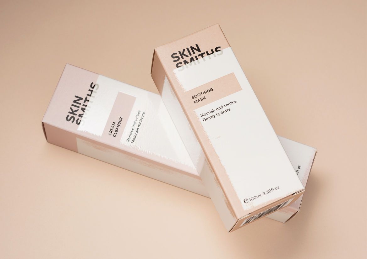
One look at Skinsmiths' packaging and you can tell they're all about the detail. Their folding carton boxes are printed in colors that represent different skintones. Their logo is in black, bold typography that's balanced with softer, minimal text for its product descriptions.
What's unique about their packaging design is how they've combined the use of uncoated paper and printed paper to represent the application of protective skincare products. The skintone colors are printed on an uncoated board, which is in then over-printed with a gloss finish, which is similar in texture to the feeling of applying skin lotion.
Henua Organics
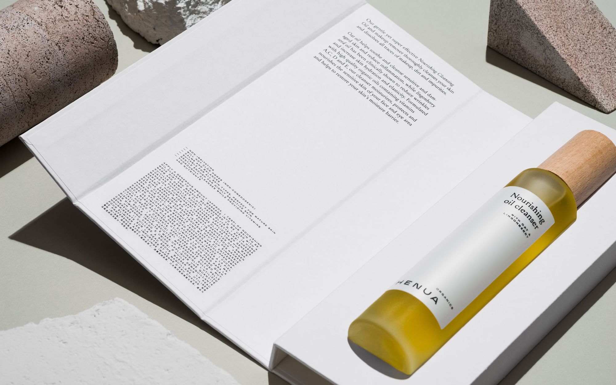
Henua is a premium, organic skincare brand that has set out to create skincare products that are balanced, pure, and bring bliss to everyone. Rather than going for the classic folding carton box, Henua opted for a sturdy magnetic lid rigid box with a custom cut out insert to securely hold its product in place.
Their minimalist black and white design makes a statement on its own, and it becomes clear very quickly that everything about Henua is luxurious and premium.
Wildsmith Skin
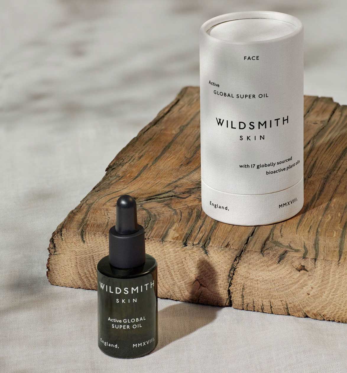
Wildsmith Skin provides sustainable skincare products by using plant derived bioactives, botanicals, and minerals. Instead of the standard custom box, Wildsmith Skin used custom printed cardboard tubes to store and protect its products. These custom tubes are made with sturdy cardboard and natural, textured paper uncoated with finishes. Printed with just black ink, Wildsmith is able to keep their packaging minimal, simple, yet eye-catching.
Two22
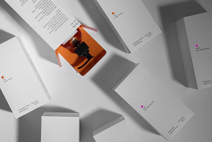
Two22 is a high-end skincare line that provides every customer with a personalized serum based on their skin type and genetic data. To package these securms, Two22 used folding carton boxes and added subtle yet aesthetic details to their box. From the foil stamped logo to the embossed outline of a serum bottle, Two22 knows a thing or two about packaging design. They've maintained a simple, minimal look with the white exterior, complementing this with a pop of color on the inside of the box.
--
Check out some of our other weekly favorites!
