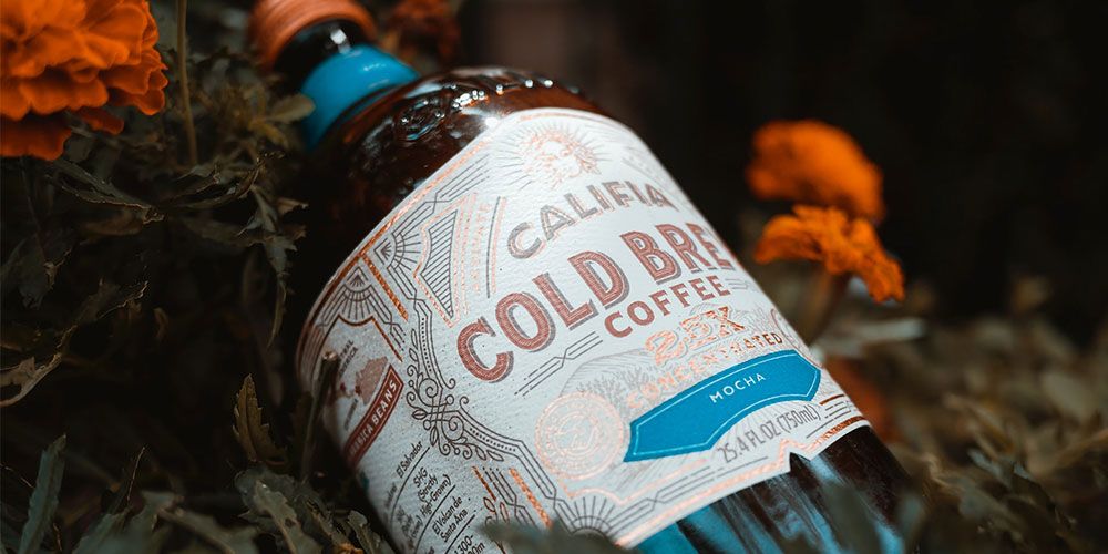
Highlight narrative, tactility, and visual delight; these five label designs elevate aesthetics, engagement, and emotion all at once. Here are the standout examples featured:
- Broken Heart Gin – A clever label split across the front and back forms a broken heart, using the bottle’s transparency and shape to reinforce emotion through design.
- Sprite’s Live From the Label – A bold label featuring oversized QR codes acts as concert “passes,” turning the label into an active gateway to virtual experiences.
- Barolo Balena – A whale-shaped debossed label with foil-stamped “Barolo,” featuring a peelable tail detail that reveals extra information and adds tactile movement to the design.
- Absolut Vodka – A minimalist bottom strip label with subtle watermarking, embossing, and glass-engraved text, combining simplicity with refined dimensional detail.
- Finca de la Rica – Labels featuring foil-colored puzzles that echo the neck capsule color, creating an interactive element as customers solve and draw on the label.
Packaging design speaks to the world of what your packaging is and ultimately what your brand represents. Label design in many bottle products is the differentiator of one packaging to another. Take a look at these creative label designs to spark inspiration in your packaging and to catch the eyes of your customers!
Broken Heart Gin
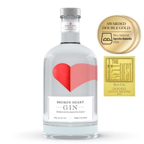
This heart label by Broken Heart Spirits is a creative way to add designs to your packaging. The hearts call to the fact that gin is generally good for the heart. The labels utilize the space of the bottle and take advantage of the fact that it is round and transparent. Half of the heart is placed at the front of the bottle over the name, and the other skewed half is placed at the back of the bottle, creating a broken heart.
A way to apply this to your own drinks packaging is to think about how shapes and colors can be made through specific overlapping and label placement.
Sprite Live From the Label
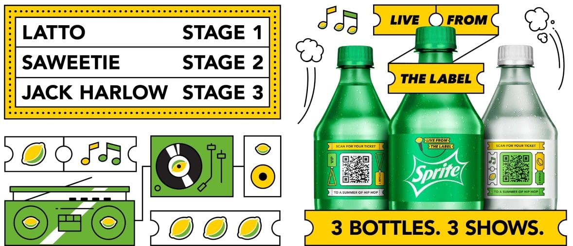
Sprite’s ‘Live From the Label’ campaign makes its bottles put emphasis on the Sprite label. The QR codes act as ticket passes and links to virtual concerts. Making these codes big on the label rather than they are normally small, markets both Sprite and the concert. This aligns with Coca-Cola’s (Sprite’s parent company) strategy of marketing towards the world by having free access to virtual concerts to connect people during the pandemic.
When applying this method, think about how your packaging can be used to promote your brand beyond just the product.
Barolo Balena
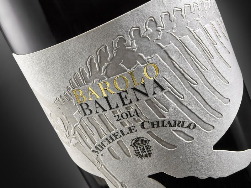
This Barolo Balena 2014 by Michele Chiarlo features a stunning whale-shaped label with immense detail. The debossing of the whale skeleton sets a wonderfully tactile and visual contrast between the design and the rest of the label. The word ‘Barolo’ is also debossed as well as foil-stamped with gold color to highlight the word with a luxurious feel. Making the whale tail peel-able with information inside shows creative use of the label. The gold and text on the other side give a nice surprise for customers. The curl of the tail simulates movement and flow.
Applying this to your packaging, think of how you can stimulate different senses and emotions in your designs.
Absolut Vodka
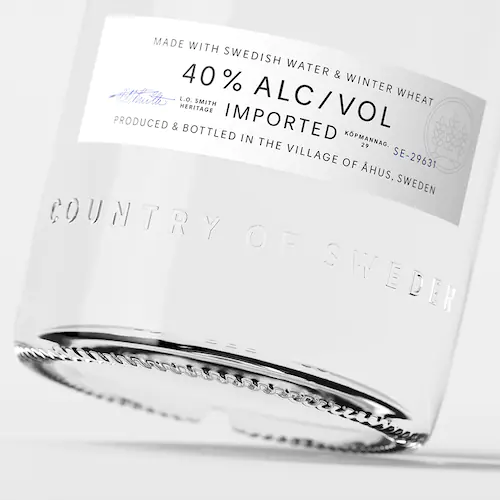
Absolut Vodka’s redesign celebrates a small strip of paper label at the bottom of the label. At first glance, it just looks like a white label with text. Taking a closer look, you can see that there is a watermark on the top right and a blue signature on the left. It is not the only thing that populates the bottle. There is embossing and words printed directing on the glass bottle. All these elements harmonize with each other to create a simple yet detailed package design.
Applying this to your packaging, think about how your packaging looks up and afar and how small details can bring your design together.
Finca de la Rica
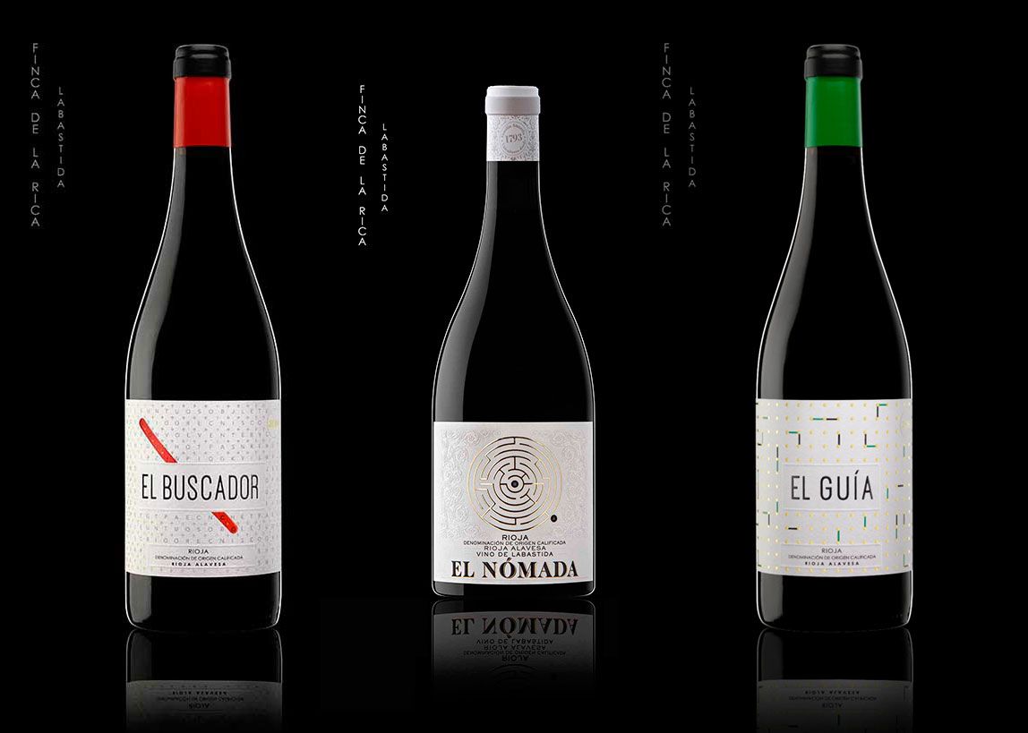
These different wines by Finca de la Rica showcase puzzles on their respective labels. Notice how red, yellow/gold and green are used in each label. Each puzzle features an element that matches the color of the foil capsule at the neck of the bottle. The puzzles on the labels can be solved and drawn on which gives customers a unique design trying to figure out the puzzle.
When applying this to your packaging, think about the use of color and how your packaging can be interactive for your customers.
--
Now that you have seen the different types of creative label designs, we hope you're able to get some inspiration and determine how to apply them for your own packaging labels.
Looking for other packaging inspiration? Check out some of our other weekly favorites:
