
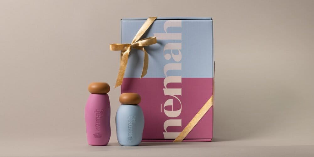
The outer surface of a mailer box is the first physical thing a customer touches when an order arrives. Before they read your logo or pull the tape, the material itself already says something about your brand. Choosing between a kraft and white substrate isn't simply a color preference - it affects how your print looks, how your brand is perceived, and how well the box aligns with your brand's visual identity. Here's how to think through that decision clearly.
1. Visual Identity and Brand Aesthetic
Kraft has a warm, raw, natural quality to it. The unbleached brown surface reads as honest and unpretentious, which is why it resonates strongly with brands in artisan food, wellness, sustainability, and handmade goods. It signals that a brand isn't trying too hard, and for the right product, that restraint is exactly the right message.
The white substrate - also known as Clay Coated News Back (CCNB) - works the opposite way. It's a clean, neutral canvas that gives a brand maximum control over its visual presentation. Colors read exactly as intended, photography reproduces with fidelity, and fine typographic detail stays crisp. For beauty, electronics, luxury goods, and any category where the packaging needs to feel polished and precise, white is typically the stronger starting point.
Neither is inherently better - they telegraph different personalities. A skincare brand built around clinical minimalism on a white substrate will look and feel very different from one built around earthy botanicals on kraft. Both can be compelling. The question is which one your customer expects when they picture your brand.
2. Print Quality and Color Accuracy
This is where the substrate difference becomes most practical. Ink behaves differently depending on what it's printed on, and the gap between kraft and white is significant if color accuracy matters to your brand.
Kraft's natural brown tone acts as an underlying tint. Bright colors become muted, and full-color CMYK printing loses fidelity - a vivid coral becomes a muted terracotta, a sky blue reads more earthy and subdued. This isn't a flaw if your design leans into it. Earthy palettes, single-color line art, and simple typographic logos can look striking on kraft precisely because the substrate adds warmth. But if your brand uses photography, photorealistic illustration, or relies on specific Pantone color matching, kraft will consistently fall short of what you see on screen.
The white CCNB substrate gives ink something close to a neutral ground. CMYK colors reproduce with far greater accuracy, gradients stay smooth, and fine detail holds. If your packaging design was built for digital-first presentation, white is what makes that design translate into print.
| Print Scenario | Kraft Substrate | White Substrate |
|---|---|---|
| Single-color or two-color logo | Works well; earthy warmth adds character | Works well; clean and precise |
| Bold, saturated brand colors | Colors appear muted; difficult to match accurately | Colors reproduce vividly and accurately |
| Photography or photorealistic print | Not recommended; brown base distorts tones | Recommended; neutral base preserves image quality |
| Foil stamping or spot UV | Effective; contrast works well on dark surface | Effective; finishes pop against white ground |
| All-white design elements | Requires white ink overprint; adds cost | Native to the substrate; no extra cost |
One practical note: if your design calls for white elements on a kraft box, those areas require a white ink pass before the color layers go on, which adds production complexity. It's doable, but it's worth factoring into your timeline and cost.
3. Sustainability Perception vs. Actual Eco Credentials
The assumption that kraft automatically means greener is widespread, and it's worth separating perception from fact here.
Kraft's brown, unbleached surface reads as natural and unprocessed, which is why it has become a visual shorthand for sustainability in packaging. There's something to that - unbleached kraft does skip certain chemical bleaching steps in processing. But the full picture is more complicated. Both kraft and white substrates can be manufactured from recycled content. Both can be printed with soy-based inks. Both are recyclable at end of life. The substrate color alone doesn't determine the actual environmental footprint of the box.
FSC certification is a more reliable indicator of responsible sourcing than the surface color of the substrate. The Forest Stewardship Council (FSC) sets standards for responsible forest management, and FSC-certified packaging ensures that the fibre used has been sourced through verified, accountable supply chains - regardless of whether the substrate is kraft or white. According to Two Sides North America, paper-based packaging is among the most recovered and recycled materials in the US packaging stream, which applies to both substrate types when produced and disposed of correctly.
At PackMojo, all materials contain at least 50% post-consumer recycled content, and all packaging is printed with soy-based inks as standard - whether you choose kraft or white. FSC-certified packaging is also available in both substrate options, starting from 300 units (compared to the standard 100-unit minimum for non-FSC mailer boxes). If your brand's sustainability story needs to be verifiable rather than just implied, FSC certification is the more credible route to take, whatever color the substrate happens to be.
4. Cost Comparison
Cost is a reasonable concern, especially for scaling brands managing packaging budgets across multiple SKUs. The good news is that kraft and white substrates at comparable weights and quantities are generally priced similarly. The base substrate choice is rarely the main driver of cost.
What does drive cost is finishing. Spot UV, foil stamping, embossing, and high-coverage full-color printing add more to a per-unit cost than the choice between kraft and white. A simple kraft box with one-color printing will cost less than a white box with full wraparound CMYK photography and a spot UV logo - but that's a finishing comparison, not a substrate one.
A few practical considerations:
- White ink on kraft (needed for white design elements) adds a print pass and increases cost modestly.
- Printing on the outside only costs the same regardless of ink coverage - a full wraparound design is priced the same as a simple logo. The cost increase comes when you add inside printing, which requires a second print pass.
- Matte and gloss lamination, foil, and emboss are available on both substrates and behave comparably in pricing.
Pricing on custom mailer boxes is quote-based and scales with quantity - the per-unit cost decreases as volume increases. Neither kraft nor white is a shortcut to a lower price; the real savings come from consolidating order quantities and keeping finishing choices purposeful.
5. Brand and Industry Fit: Which Substrate Works Where
Rather than declaring a winner, it's more useful to match each substrate to the contexts where it genuinely performs better.
Kraft tends to work well for:
- Artisan food and beverage brands where a handcrafted, honest presentation matters
- Wellness and herbal products that want to evoke natural ingredients and simplicity
- Sustainability-led brands where the kraft aesthetic reinforces a broader brand ethos
- Subscription boxes with text-heavy, editorial-style design rather than full-color imagery
- Minimal color palettes - think black on brown, forest green, terracotta - colors that complement the natural base rather than fighting it
White tends to work well for:
- Beauty and cosmetics - color accuracy and a premium feel aren't optional in this category
- Consumer electronics where clean, precise packaging needs to match the product inside
- Luxury goods that demand a refined, controlled aesthetic from the first touchpoint
- Photographic or highly detailed print - any design with gradients, fine detail, or photography that needs a neutral base to reproduce faithfully
- Brands built around bold, specific colors that need to land the same way every single time
Some brands find that splitting between the two substrates makes sense across their product line - using kraft mailer boxes for standard orders and white for gift packaging or premium tiers. That kind of variation is manageable when you're working with a supplier that handles both and keeps material quality consistent across runs.
PackMojo's mailer boxes are available in both kraft and white substrates, with the full range of print and finishing options on each. Starting from 100 units, they're accessible at early scale and built to grow with you. Production typically takes 12-16 days plus shipping, which gives most brands enough runway to plan around a seasonal push or new product launch without cutting it close.
Closing Thoughts
Neither kraft nor white is the objectively correct choice for custom ecommerce packaging. Kraft suits brands where warmth, texture, and a natural aesthetic align with what the product represents. White suits brands where color precision, photographic print, and a polished presentation are priorities. Start with brand identity and print requirements. Cost and sustainability matter too, but on both counts, the two substrates are closer than most people assume.
PackMojo makes custom mailer boxes in both kraft and white substrates, with the same range of print and finishing options available on each. Whether your brand calls for kraft's warmth or white's precision, you're choosing a look, not trading away capability.
The most reliable way to settle the question is to hold both materials in your hands. PackMojo's sample kit - available for USD 29 with free shipping - lets you compare real production-quality substrates, finishes, and print before committing to a full run of branded mailer boxes. It's a low-stakes way to make a high-confidence decision.