Color Systems in Packaging: RGB vs CMYK vs PMS
What is RGB?
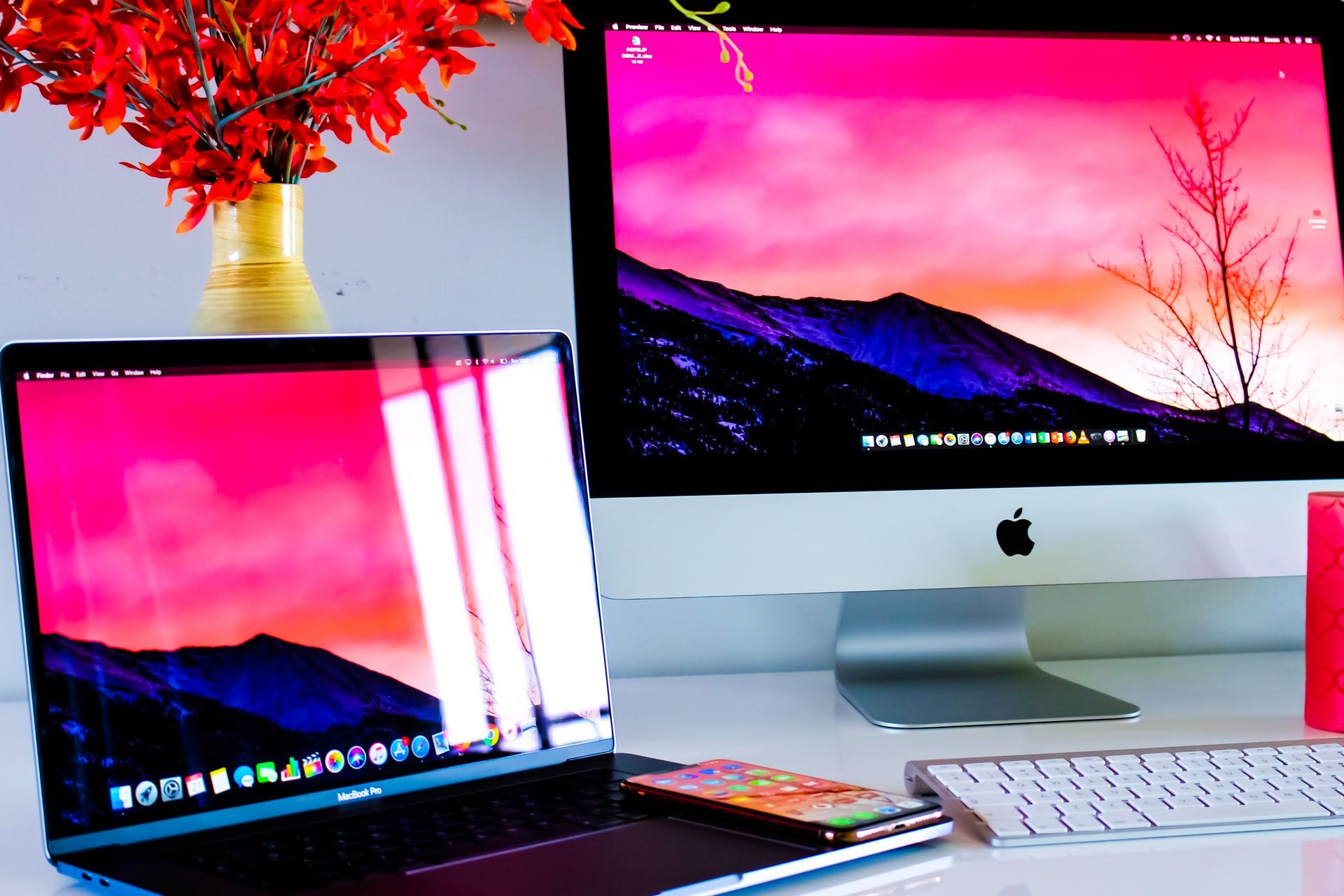
RGB stands for Red, Green, and Blue. This color system is called an additive color system, which means that with the addition of a primary color, the resulting shade gets brighter. RGB colors are made by mixing light beams of 3 colors (red, green, blue), and because these are made with light, these colors are only visible on digital devices (e.g. computer screens, mobile phones). For this reason, the RGB color system can't be used in printed packaging.

What is CMYK?
CMYK (Cyan, Magenta, Yellow, Key) is a process color made by mixing inks during the print process. Four primary inks are mixed to form your desired shade, and these form the CMYK color system.
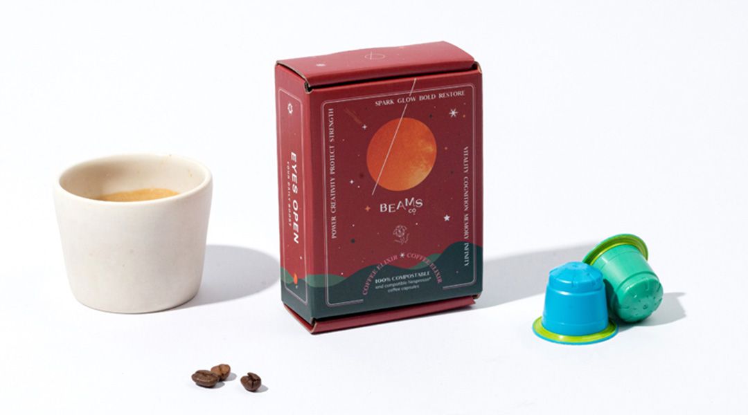
The CMYK color system is a popular choice for packaging as it consumes less ink overall. Very often, your packaging suppliers will require you to send your designs in a packaging dieline file. When you're designing on your computer, be sure to check that your document is in CMYK color mode instead of RGB, as this is a more realistic representation of the colors that will be printed. Changing the format midway may result in the colors displaying differently since CMYK tones are much lighter than RGB tones.

What is PMS?
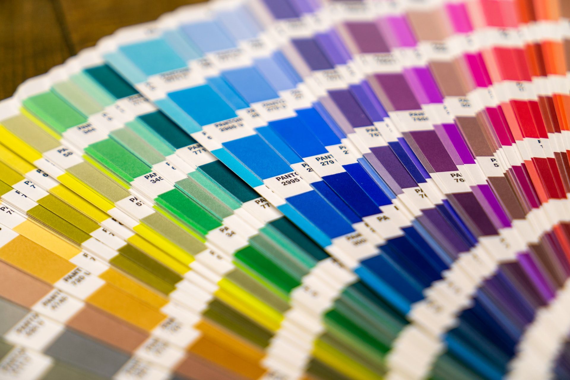
PMS stands for Pantone Matching System, or simply called Pantone. These are pre-mixed colors and have higher consistency and accuracy when printing. Use Pantone colors if the colors of your design must be extremely accurately printed every time. For example, think about the Tiffany blue or the Coca-Cola red - the colors printed must be consistent every single time or the brand image is compromised. Pantone colors are more expensive than CMYK, but are a great way to ensure color consistency.
