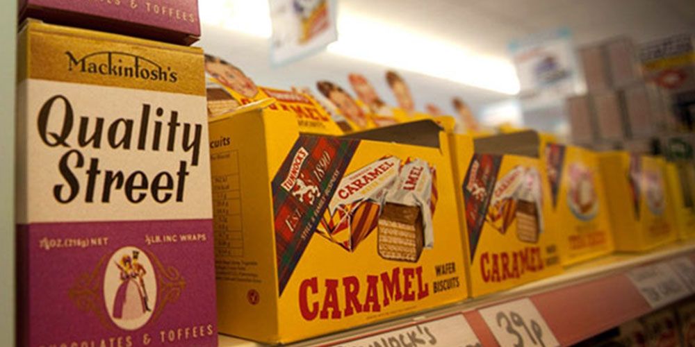
Vintage styles are making a comeback not only in the fashion world but also in many other industries. The custom packaging space is unpacking some serious retro inspiration. While it can be debated for hours as to why vintage styles are gaining popularity, there is no doubt it induces a sense of nostalgia and often represents a higher quality and value.
Retro packaging designs can be used to pack just about anything from toothpaste to chocolates and on any kind of packaging - from folding cartons to packaging sleeves. Most often, it is brands that sell products that were popular in the 70-80s that go for vintage designs. For example, shaving products, vintage clothing, etc. This helps them preserve the vintage feel of the product and adds a layer of flair to their products.
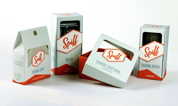
For example, to sell shaving brushes and shaving bowls, designer Oliver Lo, chose to go a vintage design to remind buyers of the shaving products used in the 1950s and how they were considered a status symbol among men.
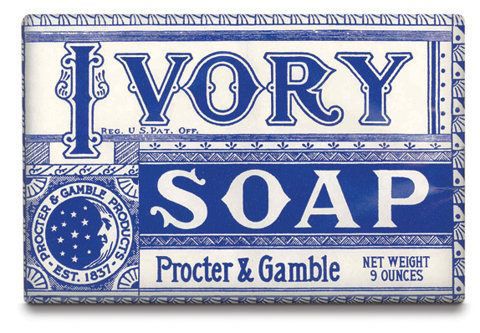
Sometimes it is brands that have been around for decades that choose retro designs to preserve their originality and showcase their old school values. For example, P&G uses vintage packaging for its Ivory Soap bars company which was founded in 1879. The design includes vintage font and the classic white and blue color combination.
If your brand chooses to go for a more vintage style, here's some inspiration that might spark some ideas!
1 - Focus on the font
Calligraphy was very popular in the 90s and is often incorporated into retro designs. According to Molly Suber Thorpe, “For many people, machine-made uniformity is now less desirable than the tiny, human imperfections and effort recognizable only in hand craftsmanship." Calligraphy or similar fonts can really help your packaging stand out.
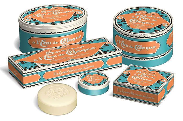
2 - Vintage color combinations
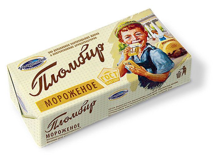
The right color combinations can not only make your packaging unique but also make it easier for customers to remember your brand. Bright and bold colors and neons were not the preferred colors. Instead, the colors that brands went for were more somber and almost dulled down. This is not to say that these colors did not look good once they were printed. Your company can do wonders with a vintage color palette. Take inspiration from the designs below.
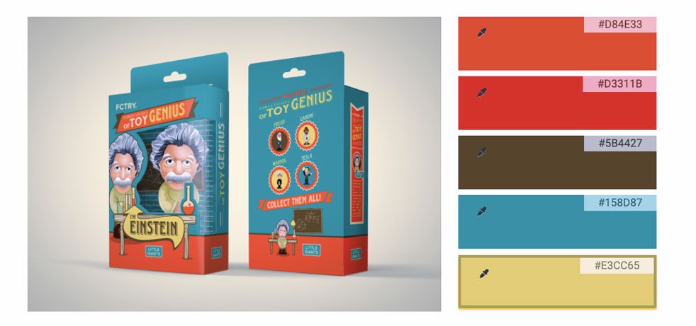
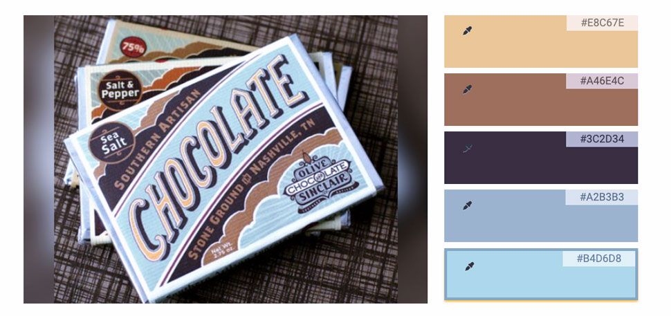
3 - Text-heavy packaging
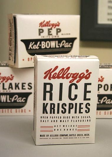
Brands would usually put a lot of text on the packaging. Companies back then essentially used packaging as free space to advertise their products and tell the customer more about it and the brand. They would put product slogans, ingredient information, and sometimes even information about manufacturing on the boxes.
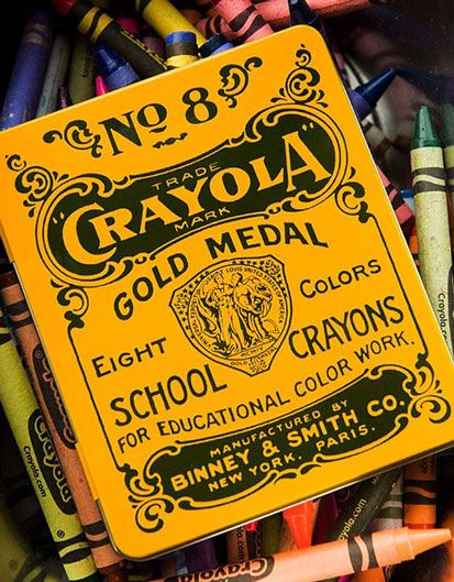
4 - Fun and colorful images
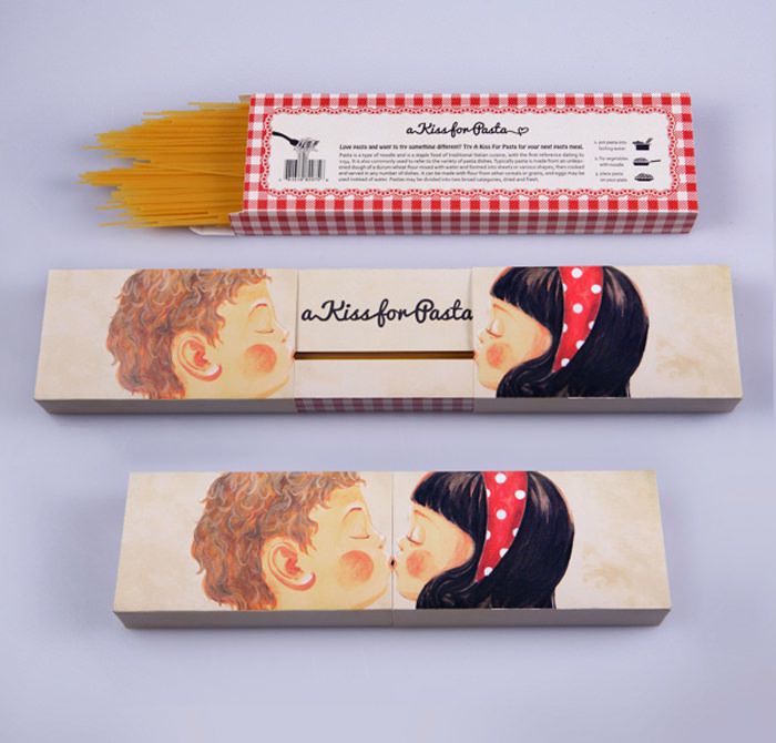
If you don’t prefer putting too much text on your boxes, why not go for fun images and comics! Hand-drawn images were often printed onto boxes in order to catch the attention of customers. Get creative with the kind of drawing you want on your packaging, like A Kiss For Pasta did with theirs. Or simply go for something classic like the lucky strike’s cigarette boxes.
Even though it is a throwback to the retro period, these new and creative designs are attracting customers and sparking the feeling of nostalgia in their minds. This helps bring brands closer to their audience.
Looking for more packaging design inspiration? Check these posts out!
Once you're ready to get custom packaging for your brand, visit our Online Packaging Quote generator to get instant prices and place your order today!
