Process Colors vs Spot Colors
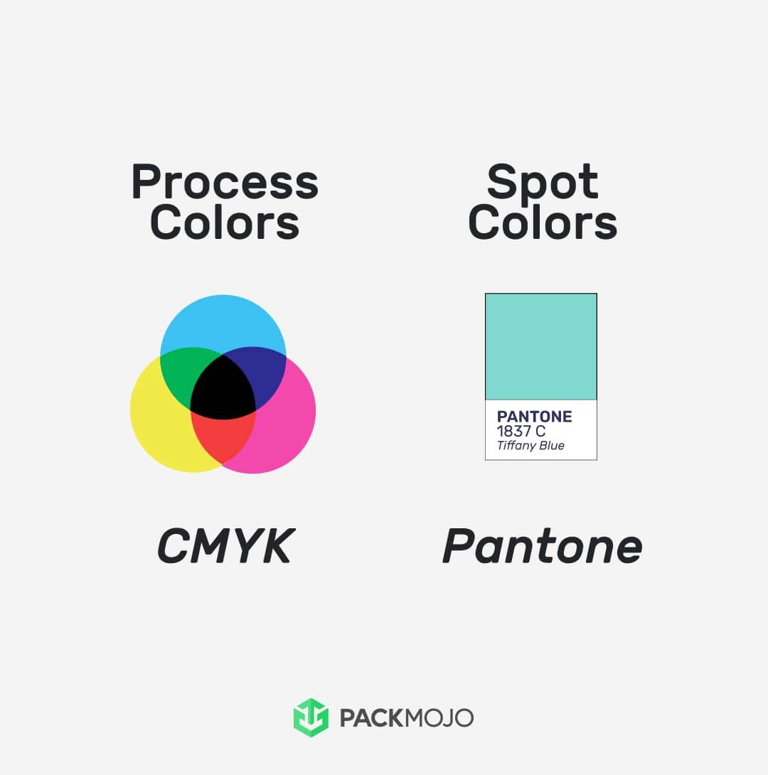
Process colors involve an overlaying print of cyan, magenta, yellow and black dots to form a spectrum of color. On the other hand, spot colors involve printing a specific color.
What are Process Colors?
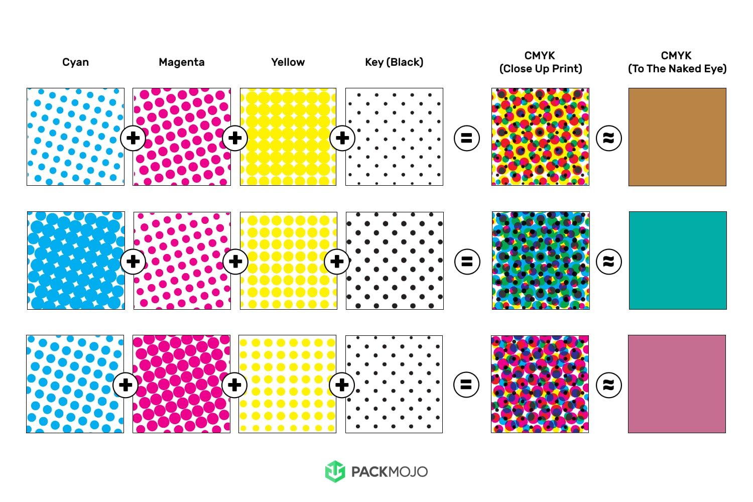
Process colors utilize the CMYK color system for printing. It involves the printing of overlaying prints consisting of dots of cyan, magenta, yellow and black. The dots are printed in various densities and combinations in order to create printed materials that appear to the naked eye as a full spectrum and gradient of color.
When packaging is printed, it often uses facilities composed of printing towers. Each print tower is only able to print one color. Therefore, when printing process colors, there will be a dedicated tower printing cyan, magenta, yellow and black respectively, totaling up to the use of four separate towers. Each tower will print their respective color.
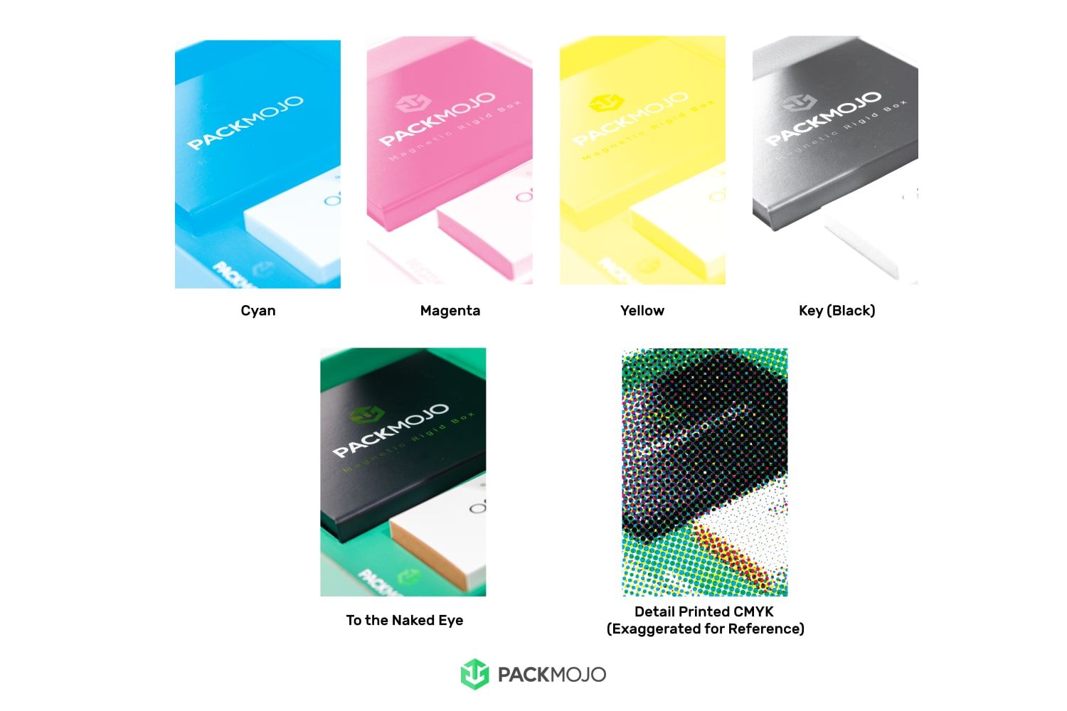
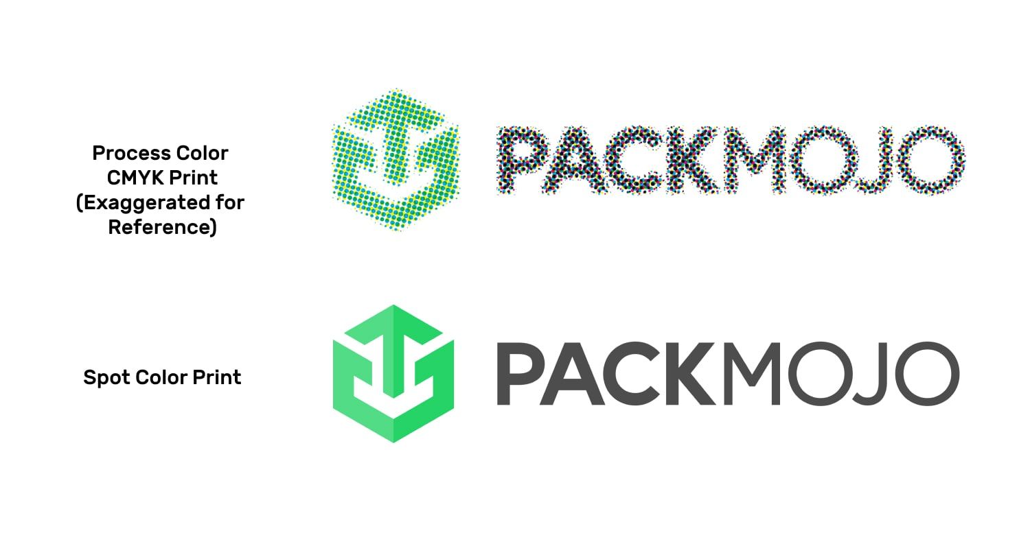
When overlaid, this is what appears to the naked eye as the color we anticipate and allows process colors to be great for printing gradients such as those that appear in photographs. However, under a magnifying glass, you will actually see individual cyan, magenta, yellow and black spots (illustrated here in the graphic). Therefore, the slightest variation in this print can often result in a slightly different color which is not noticeable in gradients but may be more noticeable across large areas of solid color.
It is important to note that with process colors, there can be slight variations between runs due to various factors such as the color tuning of print machines when accounting for ink, finishes and paper. Generally with photographs, these variations will be indistinguishable. However, with larger areas of solid color also known as flooded colors, these inconsistencies will be more easily noticed.
What are Spot Colors?
Spot colors refer to a technique wherein ink color is premixed before use. These premixed colors are then printed directly and thus only require one print tower for use. As a result of being premixed, spot colors are predetermined. This therefore ensures that the outcome is a color that will be consistent across different suppliers, machines and runs. No matter how close you look, the printed spots will show the same color as opposed to the different color dots seen with when looking at process color through a magnifying glass.
There are many brands with their own classification of spot colors, with Pantone being the leading global brand. Though Pantone is the most universally known color guide, it is important to note that there are other color guides such as RAL, Toyo, DIC, ANPA, GCMI, HKS. In short, spot color is the technique of using a premixed color, and Pantone is the most universally used color guide system that utilizes this technique and helps people identify specific colors.
For spot colors, color tuning for accounting for paper type and print finishes is done such that it aims to produce the exact same specific color, resulting in consistent color across different runs, machines and suppliers. If there is an exact color you’re chasing, spot color will allow you to achieve that. Do note that since print facilities often have a limited number of print towers, this will limit the number of spot colors you are able to use. As most facilities have six towers, four of which are used for CMYK, the limit for spot colors is typically two. If you require more, it is best to speak with your packaging producer as they may be able to accommodate more for a higher cost.
Flooded Colors
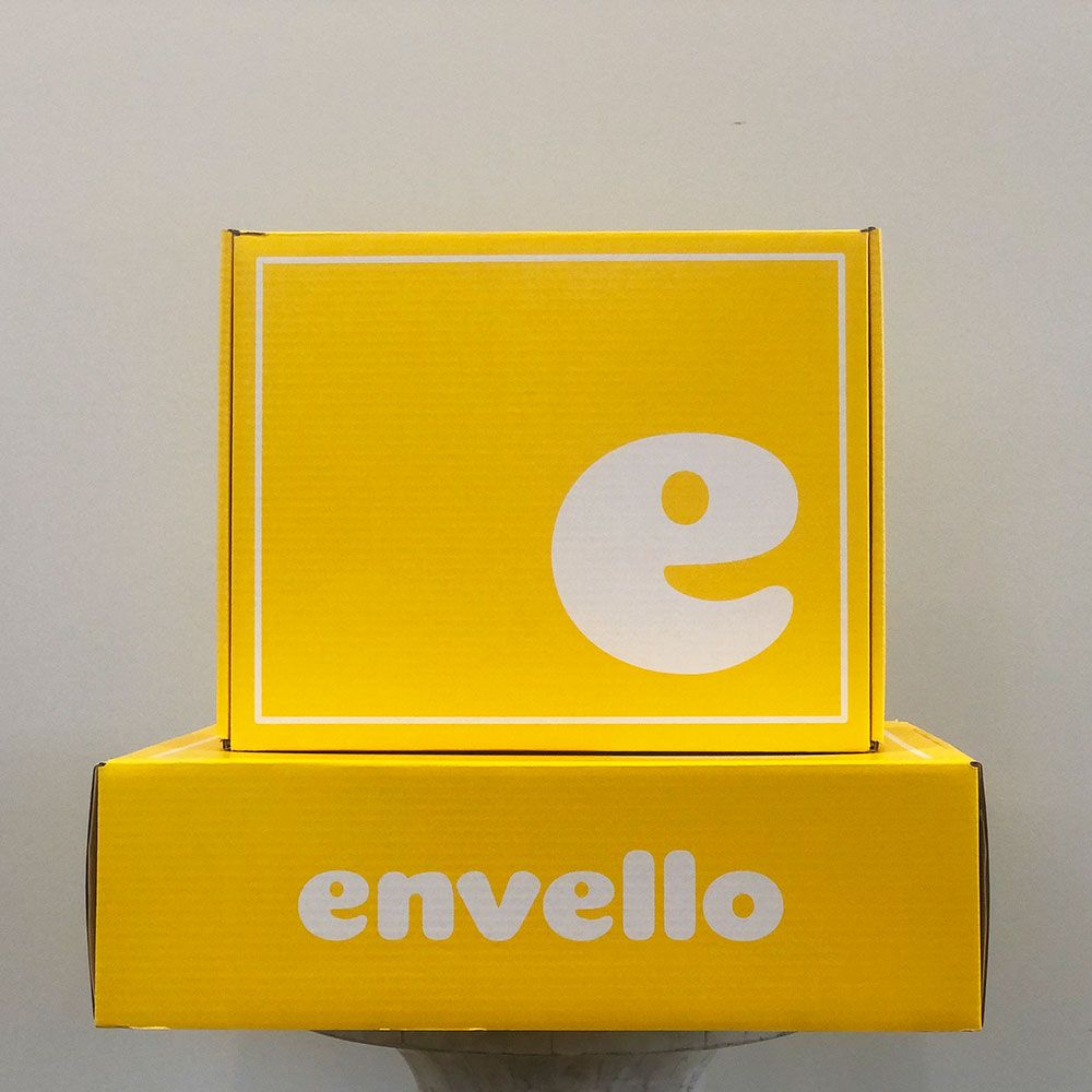
Flooded colors are when one color is used across a large area, such as the background color of a box. When it comes to printing flooded colors with CMYK, there can often be noticeable inconsistencies not only with future runs but also within the current run. With future runs, there can be color inconsistencies due to using different batches of paper or when the machine is tuned slightly differently. Within the same run, there may be ever so slight inconsistencies with the print of the overlaying CMYK ink between the first and last print of the batch. Since the flooded color covers such a significant area, differences between these two would be noticeable to the naked eye. Thus, with flooded colors, we often recommend using spot colors to ensure consistency across prints.
When Should I Use Spot Colors vs Process Colors?
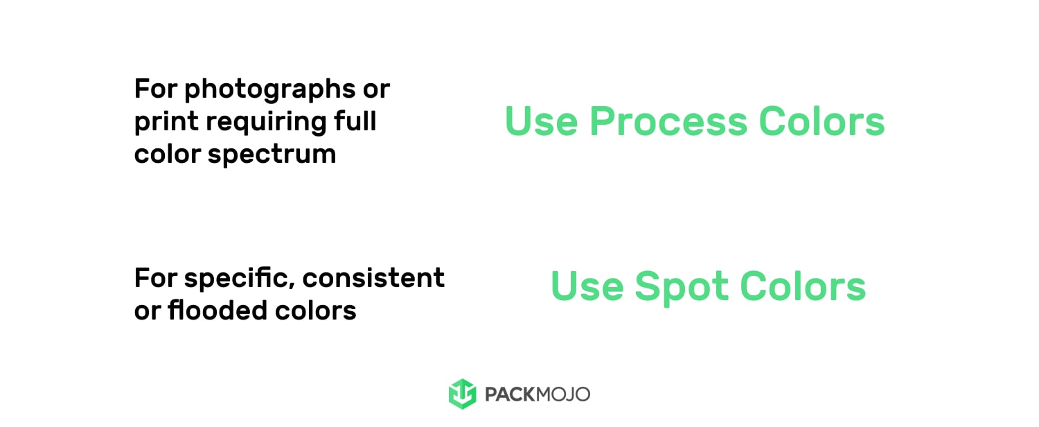
Due to its ability to create a full spectrum of colors, process color is best used in situations where photographs or gradients need to be printed on packaging, or when specific colors do not need to be achieved. However, since process colors are essentially four individual colors that are “optically mixed” to appear as one color to the naked eye, you should consider spot colors in situations where you require a specific or consistent color. For flooded colors, which refers to large areas of an individual color, we would also recommend the use of spot color as using process color for large areas will make any color differences more noticeable across print runs.
