Printing on Kraft Paper Guide
While the use of kraft paper is great from an eco-friendliness standpoint, it comes with some limitations, especially with full color print. Colors tend to look duller when printed on a brown kraft material compared to artwork print on white paper. This page will help you understand our recommended best practice.
Full color on kraft paper
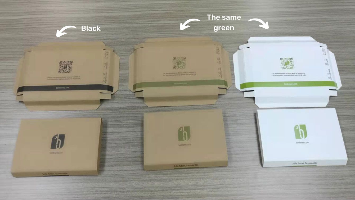
Here's an example of the same green color printed on a kraft material and white material. You can see that the green comes out much duller on the kraft material, and doesn't look as sharp compared to when it's printed on white paper.
Our recommendation
- Kraft material: stick to designs with black ink or white ink only.
- Full color artwork: opt for a white material instead to ensure your artwork comes out vibrant.

Black & white ink on kraft paper
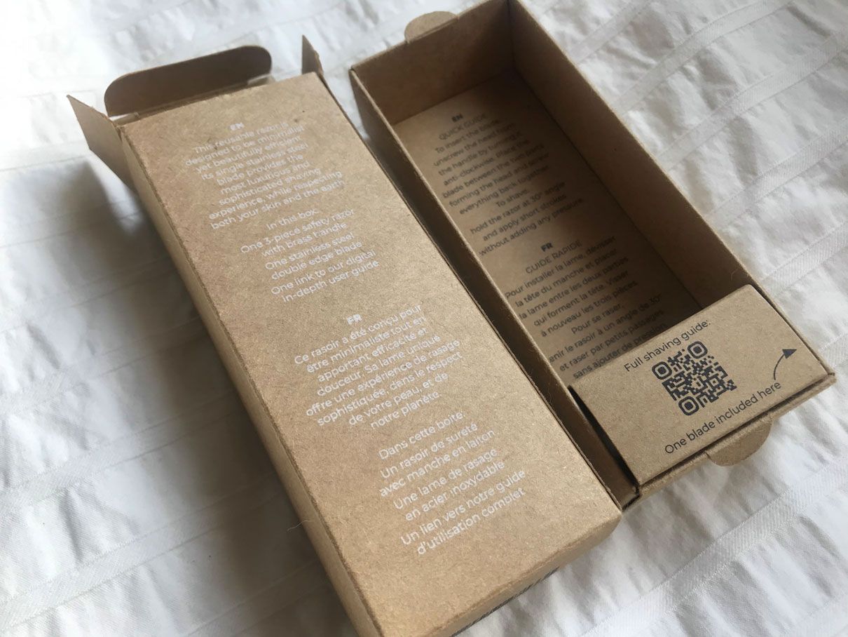
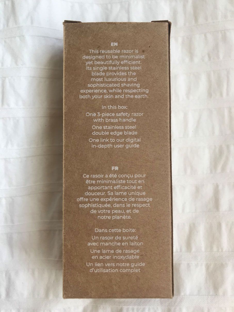
Printing black and white ink on kraft paper can give your packaging an elegant, minimal look, and you don't have to worry about the colors being dull when printed on kraft.

