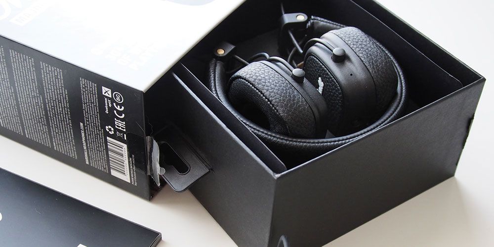
Spotlight intuitive design in every tray, sleeve, and printed detail; these five electronics packaging ideas enhance presentation, protection, and personality. Here are the standout examples featured:
- eZLO Exo 1100 Kraft Tray & Sleeve – A paper tray and sleeve structure with custom inserts that secure components and even hide wires in a smart booklet-style layout, all biodegradable.
- L’Oréal UV Sense Brochure Box – A brochure-style display packaging with multiple faces and a front cutout window, offering an elegant presentation for showcasing the product.
- Blink Smartwatch Hinged Rigid Box – A book-like rigid box with removable insert, slide-out tray with ribbon pull, and a playful word search design revealed through alignment of holes in the sleeve.
- Lapka Kraft Tray & Sleeve – Minimalist packaging featuring a kraft paper sleeve with an integrated lock and internal insert, printed in single-color to match the product’s minimal aesthetic.
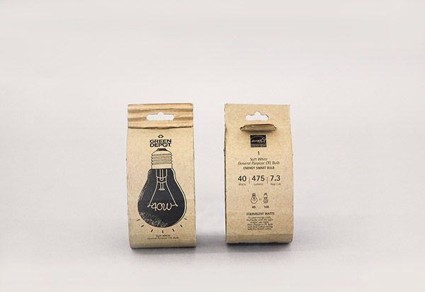
- Green Depot Corrugated Sleeve – A corrugated sleeve designed to wrap and protect light bulbs; made from fully recycled cardboard, foldable with a secure seal and minimalist printing.
Consider Apple’s products, the brand uses its packaging to enclose multiple products in one box. The rigid boxes with a separate lid are made of sturdy and thick paperboard for maximum protection while also keeping the weight of the packaging low and also promoting eco-friendliness. In terms of branding, the plain white boxes with the apple logo depict the brand’s minimalistic style.
Electronic products are considered to be fragile and are sometimes expensive to make put together. In such a case the packaging is considered one of the most important aspects of the product as it not only protects the device during shipping and transportation but also acts as a marketing tool for the brand. Here are our 5 favorite packaging design ideas for electronics.
1 - eZLO
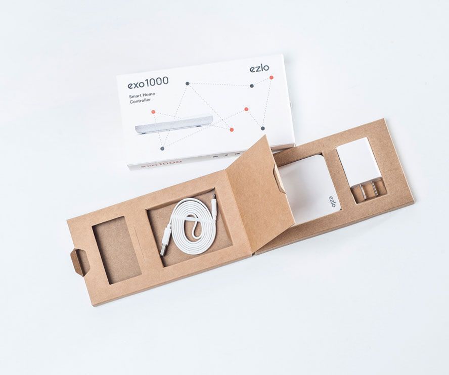
eZLO’s Exo 1100 is a smart home controller which is packaged in a paper tray and sleeve box. The tray contains custom inserts to hold different parts of the product. Inserts not only help to keep the items in place and give them an extra layer of protection but also contributes to an exciting unboxing experience. To have a clean and smooth flow of the view of all the elements of the product, the wires are hidden inside a second compartment in a booklet-type tray.
The sleeve is made and paperboard, while the tray is made of recycled paper. By skipping the use of plastics and lamination, the brand has made sure the entire packaging is biodegradable.
2 - L’Oreal
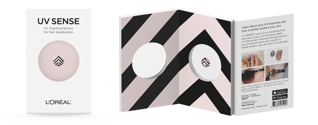
While L’Oreal is not a tech company or even remotely related to electronics, its latest nail art gizmo UV Sense is the first UV wearable battery-less sensor that will detect harmful overexposure to UV rays in order to prevent skin cancer.
This brochure-type packaging is perfect for display in trade shows and retail counters, especially when it comes to introducing and showcasing new products. The different ‘faces’ of the brochure give them a different angle to display their product. There is enough space to include information about the product and its use. A cutout window on the front face gives customers a sneak peek into the product.
3 - Blink Smartwatch
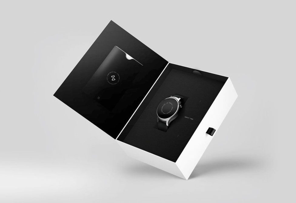
Blink Watches chose to go for rigid box packaging in the form of a hinged rigid box (similar to a book). The inside of the box contains an insert that holds the wearable in place. The insert is removable and leaves space to store other items such as a manual, warranty cards, etc. A ribbon on the side of the tray makes it easy to pull it out of the sleeve.
The design for Blink Watch’s packaging is also noteworthy. The top of the box has printed on it a word search-like design. The sleeve contains holes that align with the word search design to spell out ‘watch’.
4 - Lapka
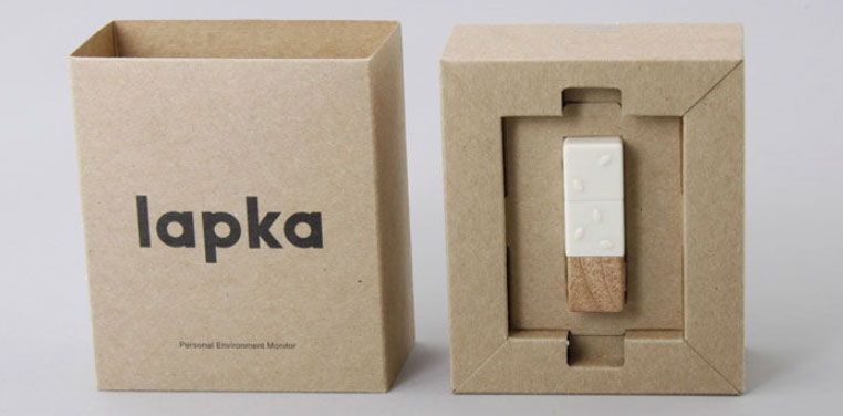
Lapka designs and manufactures smartphone-assisted breathalyzer and concept sensors. For their iPhone sensor, they designed an eco-friendly kraft tray and sleeve box. A sleeve with an integrated lock encapsulates a tray with an insert that holds the sensor. The brand intentionally used kraft paper boxes, single color print, and limited the product information to make keep with minimalistic features of the product design.
5 - Green Depot
Green Depot aimed to create an eco-friendly packaging sleeve for their light bulbs. The corrugated packaging allows for the sleeve be to folded around the bulb easily offering it protection from damages. The packaging comes with a seal to prevent the sleeve from rolling out. The cardboard used is a 100% recycled corrugated cardboard, which makes the packaging easy to recycle. The printing is also kept minimal.
Curious to know what other weekly favorites included? Check them out here.
- Weekly Favorites: Packaging For Chocolates
- Weekly Favorites: Creative uses of packaging add-ons
- Weekly Favorites: Packaging Designs for Jewelry
If you're looking to try a sample of our boxes, check out our sample kits here.
