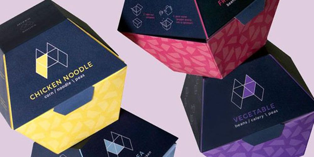
Discover how innovative geometric packaging designs can improve your brand's presence. This article showcases our selection of best geometric packaging:
- Lakeland's right triangular prism-shaped boxes for pots and pans, optimizing space and materials.
- Slice Pizzeria's triangular boxes for individual pizza slices that assemble into a full pizza.
- Nikka Whiskey's origami-inspired packaging that transforms into various shapes, reflecting Japanese culture.
- Papier Tigre's recycled paper perfume boxes influenced by origami aesthetics.
- Bottura's stylish takeaway boxes inspired by Bolognese architecture, combining form and function.
When we think of packaging, we like to stay within the confines of cuboids. For years, designers have stuck to standard box shapes and innovated the artwork, use of colors, patterns, and techniques in printing. However, designers have recently started to update traditional packaging boxes in terms of their shape, size, and materials.
Geometric packaging designs break away from the squares or rectangular, to offer a wide variety of other shapes, including hexagonal, octagonal, triangle, and so on. With these geometric designs, a brand can ensure its product stands out and enhance the convenient features of its packaging. Below are 5 brands that are innovating packaging with their geometric shapes.
1 - Lakeland
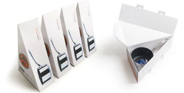
Lakeland uses a right triangular prism-shaped box to package their pots and pans. These boxes not only make the brands with traditional packaging seem outdated but also ensure efficient use of space and materials. These paper-based boxes are easy to assemble and contain a locking system. Thanks to the unique design, the artwork on the box is kept simple yet informative.
2 - Slice Pizzeria
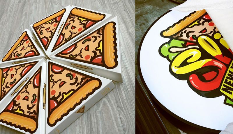
Slice Pizzeria based in Korea put on their thinking caps and came up with a box to store single slices of pizza. These make it easier for customers to buy in small quantities and even get each slice from a different pizza. When put together these individual boxes form the entire package (a delicious round pizza).
These triangular boxes are made similar to mailer boxes, meaning they can be easily assembled with the need for glue or any industrial equipment. They open by pulling the hinged lid up, just like mailer boxes, giving the customers a way to take the slice of pizza out. The artwork consists of the Slice logo.
3 - Nikka Whiskey
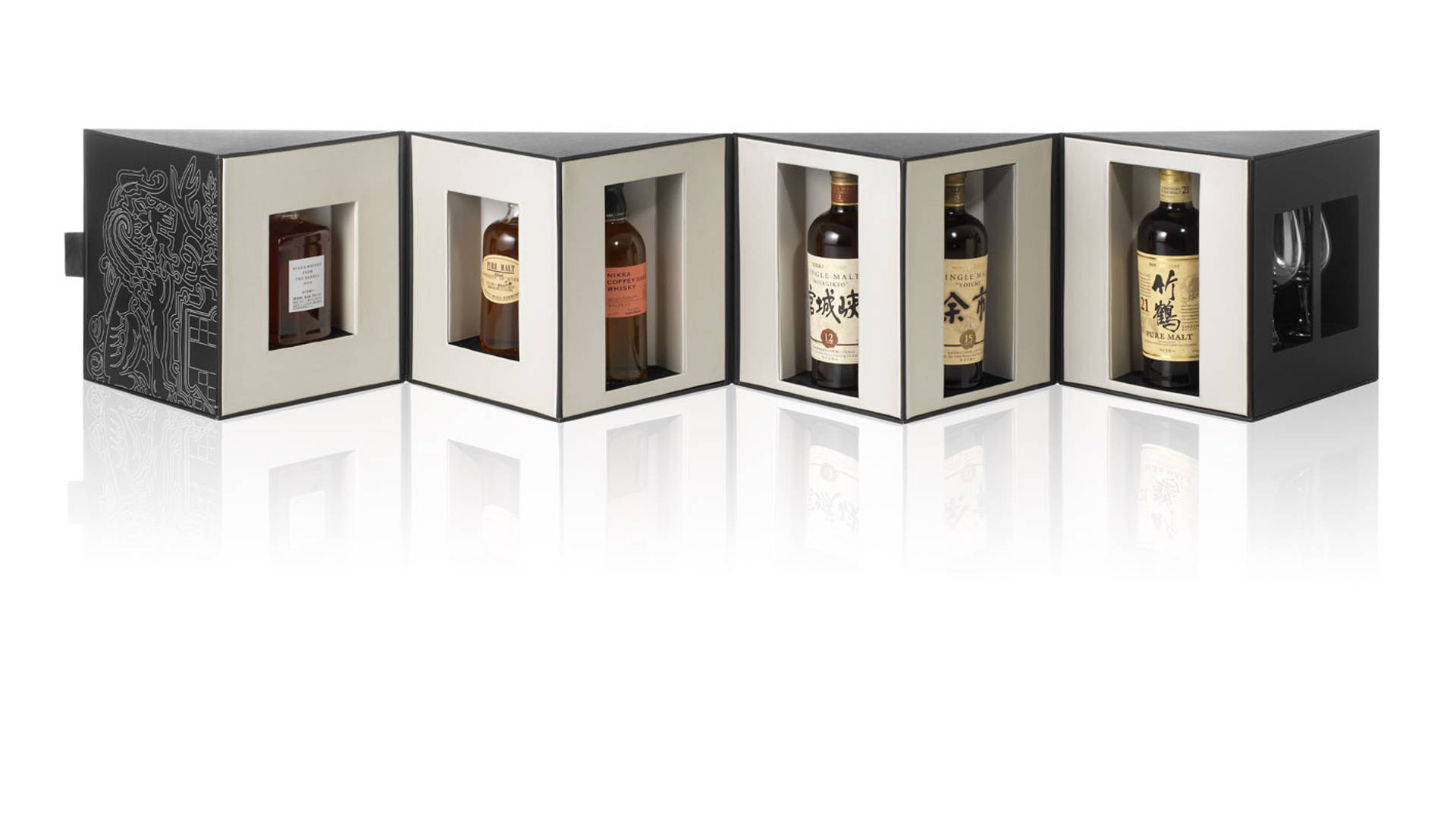
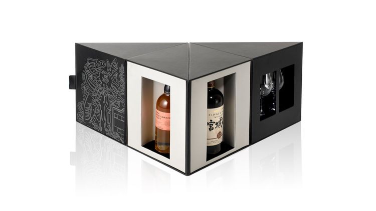
Nikka Whiskey came up with a special edition packaging design that can be configured in several forms to form different shapes. This Japanese whiskey brand tells its story with its packaging. The use of origami and many artful folds and forms represents Japanese culture and the origins of the brand.
The whiskey box is made up of several displays with hinges, which gives the packaging the freedom to take multiple shapes. When configured in certain ways, the box can also take on the shape of a tabletop tray to place the whiskey bottles on.
4 - Papier Tigre
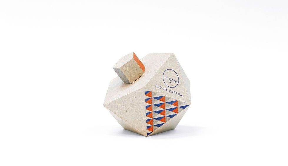
This french stationery company made its way into the fragrance industry by using its packaging and brand values to stand out from competitors. These perfume bottles are made entirely of recycled paper from Papier Tigre’s stationery division. The packaging is inspired by his paper world that is influenced by origami.
5 - Bottura
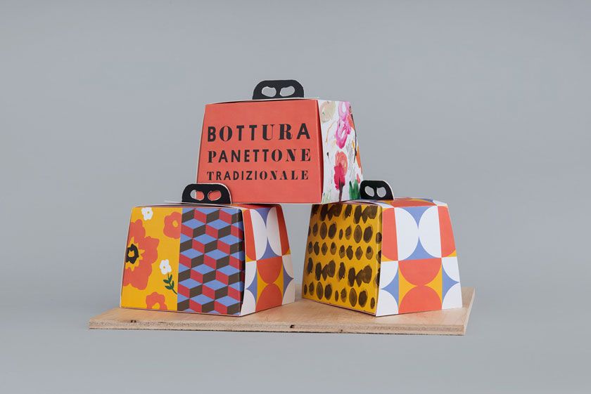
Italian eatery and restaurant Bottura innovated its takeaway boxes to make them more stylish and classy. Italy known for its commitment to fashion, style, and elegance is portrayed throughout Bottura’s takeaway packaging boxes. Made of paper, these boxes can be stored in a flattened manner and have to simply be assembled into shape when needed. The handle makes it easier to carry and transport the food. The artwork is equally eye-catching. Colors are inspired by the warm hues of Bolognese food and its iconic brick roofs, forming a hearty palette.
Brands are now crafting packaging to reference origami, culture, and even floral shapes. This unique approach to design has piqued consumer’s interest and enhanced their unboxing experience and ultimately put these brands in the limelight.
Check out some of our other weekly favorites:
