Embossing and debossing are two of the most effective ways to add tactile dimension and visual presence to custom packaging. Both techniques create a lasting impression on a customer's first touch, yet they achieve distinctly different effects. Choosing between them is one of the more important finish decisions a scaling brand will make.
The embossing debossing difference isn't just directional. It shapes how your packaging feels, how it photographs, which substrates carry it well, and how much it costs to produce. Understanding both techniques clearly before committing to a full production run helps ensure you get the best result for your brand.
1. Embossing: The Raised Relief Effect
Embossing works by pressing the substrate upward from below using a matched pair of dies. One die sits behind the material, the other applies pressure from the front, and the result is a design element that literally sits above the surrounding surface. Letters, logos, and graphic marks all become three-dimensional, catching light from one angle and casting a faint shadow from another.
The technique performs best on substrates with enough body to hold the lift cleanly. Paperboard folding cartons are particularly well suited - the material has enough thickness and consistency to produce a crisp, prominent raised impression. Rigid boxes are a different story. Because rigid boxes are constructed from a thin substrate (the printed wrap paper) glued onto greyboard, the embossing result depends heavily on what you're trying to achieve. A deep emboss - where the die presses through the full structure - can work well for bold, large-scale designs. But for smaller logos, fine text, or thin lines, the embossing is typically limited to the substrate layer only, and because that wrap paper is quite thin, the raised effect won't be nearly as prominent as it would on a folding carton. It's one of those cases where the same finish can look dramatically different depending on the box type. For more details, this page covers the specifics.
When no ink or foil is added, the technique is called blind embossing. The impression reads purely through texture and light, making it a refined choice for brands that want tactile presence without added color.
2. Debossing: The Pressed-In Impression
Debossing is the inverse process. A die presses the design into the surface from above, creating a recessed impression rather than a raised one. The visual effect is quieter. Light falls into the recess and creates a subtle shadow, integrating the mark into the material rather than projecting it outward.
That restraint is useful for certain aesthetics. Many luxury and beauty brands choose debossed logo packaging specifically because it reads as intentional and considered rather than loud. On rigid boxes covered in matte or textured paper, a debossed logo can look exceptionally refined. Thicker substrates also carry debossing well, since the material has more depth to absorb the press without risk of fracture.
3. Combining Either Technique with Foil Stamping or Spot UV
Both embossing and debossing become considerably more expressive when layered with other finishes. The two most common combinations are foil-embossing and deboss-with-spot-UV, and they work in distinct ways.
Foil-embossing bonds a metallic or pigmented foil to the raised area in the same press cycle. The result is a mark that's simultaneously elevated and reflective. Gold foil on a raised logo against a matte black rigid box lid is a familiar example, and for good reason. It reads as premium from across a retail shelf and photographs well in unboxing content.
Deboss-with-spot-UV fills the recessed impression with a gloss coating, creating contrast between the sunken, shiny area and the surrounding matte surface. The effect is more subtle than foil-emboss but still highly tactile. It works particularly well on folding cartons and tray and sleeve boxes where a full foil treatment might feel heavy.
A few practical points worth noting when layering finishes:
- Foil-emboss requires precise die registration and typically adds to tooling cost compared to blind emboss alone.
- Spot UV applied inside a deboss recess needs a substrate thick enough to hold the coating without it bleeding over the edge.
- On rigid boxes, the substrate wrap material is what receives the finish, so substrate choice at the wrap stage drives what's achievable.
- On folding cartons, the paperboard weight determines how much lift or depth the die can create without weakening the panel. Folding cartons are generally the stronger substrate for embossing, since the full paperboard thickness receives the impression.
4. Side-by-Side: Embossing vs. Debossing Compared
The table below covers the key decision factors in one place. Use it as a working reference - many brands find that testing both on a physical sample is the most reliable way to decide.
| Factor | Embossing | Debossing |
|---|---|---|
| Tactile effect | Raised, projecting outward from surface | Recessed, pressed into surface |
| Visual impact | Bold, prominent, light-catching from multiple angles | Subtle, shadow-play, integrates quietly into surface |
| Best for | Bold logos, large letterforms, gift packaging, shelf impact | Fine detail, minimal aesthetics, luxury and beauty brands |
| Substrate fit | Folding carton paperboard (best results); rigid boxes suited to deep emboss with bold designs only - fine detail is limited by the thin wrap substrate | Works well on thicker substrates; handles finer lines better than embossing, including on rigid box wraps |
| Common combinations | Blind emboss, foil-emboss | Blind deboss, deboss + spot UV, deboss + foil |
| Cost considerations | Tooling cost for dies applies to both; foil-emboss adds material cost | Comparable tooling cost; deboss + spot UV typically lower than foil |
| Brand tone | Confident, expressive, celebratory | Restrained, modern, premium-minimal |
Neither finish is objectively superior. The right choice depends on your design goals, the material you're using, and the overall impression you want to leave.
5. Real Brand Applications: Who Uses What and Why
Category context is often the fastest way to calibrate your own decision. Here's how embossing and debossing tend to map across product categories that care most about packaging finish.
Why do so many beauty and fragrance brands gravitate toward debossing? Because a skincare brand using a matte rigid box with a debossed wordmark signals precision and restraint. The recessed logo doesn't compete with the product; it confirms that the brand has thought carefully about every surface.
Spirits, luxury goods, and gift packaging favor foil-embossing where shelf presence matters. An embossed gift box with a gold-foiled crest communicates occasion and value in the same gesture. For brands in these categories, the raised mark is meant to be noticed from a distance.
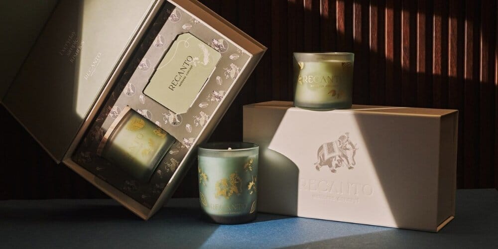
Candle and fragrance brands frequently use blind embossing on kraft-wrapped packaging or natural-textured paper. The raised logo reads as artisanal and considered without any additional color, which suits the earthy, ingredient-forward positioning many candle brands cultivate. This technique carries best on folding cartons or thicker paperboard where the full material receives the impression - on rigid boxes, a bolder, larger design will produce a more noticeable result than fine linework.
The logic is similar for consumer electronics and accessories, though the execution is different. These brands often opt for deboss on rigid drawer boxes or magnetic closure boxes, where the packaging itself is retained as a display piece. A cleanly debossed brand mark on a matte black surface tends to age well as a desk or shelf object.
6. Choosing the Right Finish for Your Brand
A few practical factors should guide the decision alongside aesthetic preference.
- Your artwork complexity: Simple logos and large type suit embossing; intricate line work or fine typography hold up better in deboss.
- Your substrate: Confirm the paper weight and covering material with your packaging partner before specifying a finish. This is especially important for embossing on rigid boxes, where the thin wrap substrate limits how prominent the effect will be for fine details. A finish that looks right on a design file can behave differently on the actual material.
- Your layering goals: If you want metallic shine alongside tactile texture, foil-emboss is the natural choice. If you want contrast without the reflective quality, deboss-with-spot-UV is worth considering.
- Your production volume: Die tooling is a fixed cost spread across your run. At lower quantities, the per-unit impact of that cost is higher, so it's worth factoring into your budget planning.
- Your brand tone: Bold and celebratory points toward embossing. Minimal and precise points toward debossing. When in doubt, the substrate and the brand's overall visual language usually resolve the question.
The best way to know if a finish works is to see and feel it on actual material. PackMojo offers a sample kit for USD 29 that lets you compare real production finishes across box types and materials, including a set of sample slabs with embossing and debossing. For brands finalizing a custom embossed box or an embossed logo packaging decision, handling physical samples before approving a run removes a significant amount of guesswork. Several sample types are also available - including press proofs and full pre-production samples - so you can review the exact finish on your specific substrate before production begins.
If you're working through a more complex structural brief - say, a magnetic closure rigid box with a debossed logo and foam insert - PackMojo's team can advise on which finish combinations are achievable on a given substrate and box style.
Closing Thoughts
Neither embossing nor debossing is the universally correct answer. Both are legitimate tools for building tactile, memorable packaging, and the better choice is simply the one that matches how your brand should feel in someone's hands. If you're still weighing the options, ordering a sample kit is the most practical next step - it's far easier to make this decision from a physical reference than from a screen.